
A House and Home promotion
If there's one thing our Supplier of the Month for April, Little Greene Paints and Wallpapers, is an expert on, you better believe it's colour. As we see people move away from greys as neutrals in the home, who better to ask than the team at Little Greene for the new colours taking the reigns this year? Ruth Mottershead, Marketing Director at Little Greene, is the woman with all the answers, so take it away, Ruth!
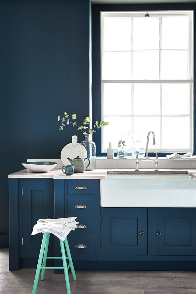 Little Greene - Hicks Blue
What colours do you see coming in in place of the greys we've become used to?
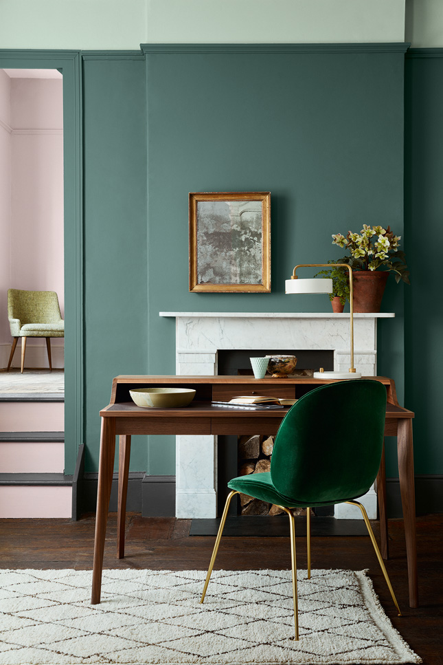
Blues and greens continue to be incredibly popular at the moment, especially used as an all over to replace grey, we call these the ‘new neutrals’ – which are soft muted tones that contain a little black in the pigment, our ‘Livid’ and ‘Hicks’ Blue’ are perfect examples of ‘new neutrals’. In 2018, we will see the resurgence of green used all over. Customers are certainly being much braver with their schemes!
What's driving this move away from more neutral greys and into bolder shades?
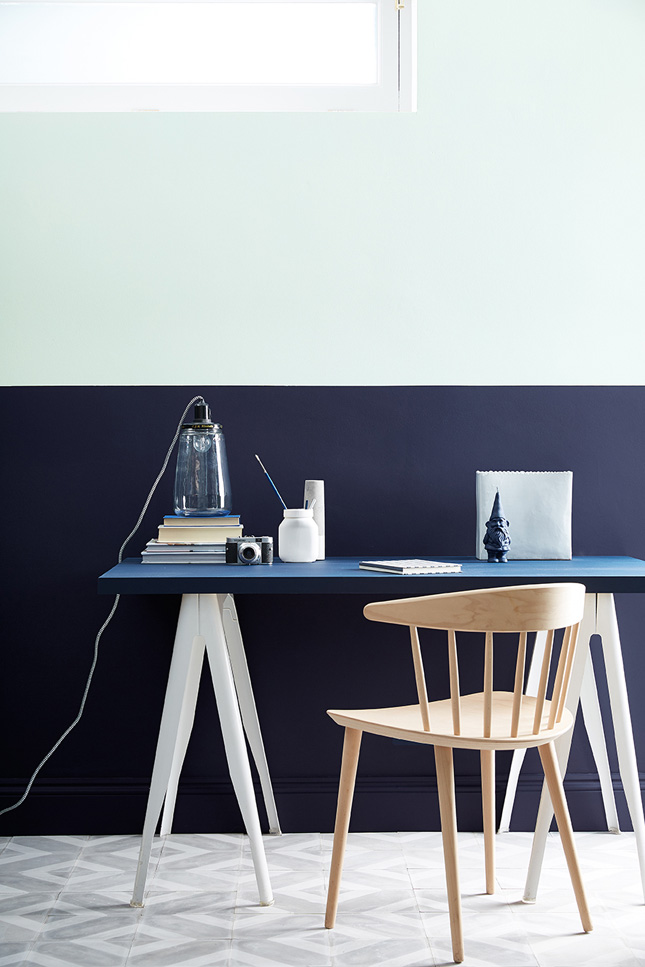
Since the launch of our capsule collection ‘Blue’ in 2015, dark navy colours and bold blue tones have become more and more popular. Stemming from the success of grey, dark blues such as ‘Hicks Blue’ and ‘Dock Blue’ have become a natural choice over dark grey tones such as ‘Scree’. As homeowners have become increasingly more comfortable with these natural tones, we are now experiencing a shift towards the use of strong greens such as ‘Pleat’, ‘Livid’ and ‘Mid Azure Green’.
Have you any new additions to your colour cards to reflect this trend?
Yes, ‘Mid Azure Green’, ‘Pleat’, ‘Livid’ and ‘Pale Lupin’ are some of our latest colour additions along with the ‘Aquamarine’ & ‘Dorchester Pink’ Colour Scales family, which is four shades of the same colour stepped in strength to achieve a harmonious colour combination when used together. We expect our pinks ‘Dorchester Pink’ and ‘Confetti’ will be extremely popular teamed with our muted greens, ‘Livid’ & ‘Pleat’.
Do these shades work well in any particular room?
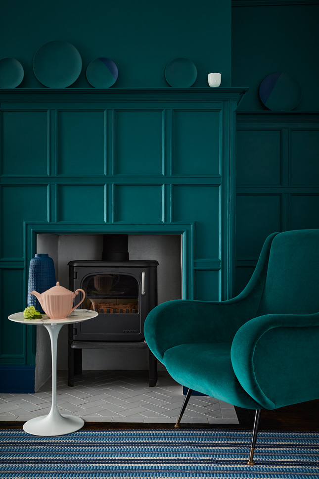
To create a restful environment, our muted green ‘Pleat’ would work perfectly in a lounge or study combined with ‘Confetti’ on an opposing wall and ‘Scree’ on the skirting. Used in combination, our clean ‘Aquamarine’ Colour Scales will give a cool and tranquil feel to your kitchen. Our moody ‘Livid’ colour makes for a soothing bathroom environment and ‘Mid Azure Green’ used all over is the ultimate choice if you want to create drama in the dining room.


