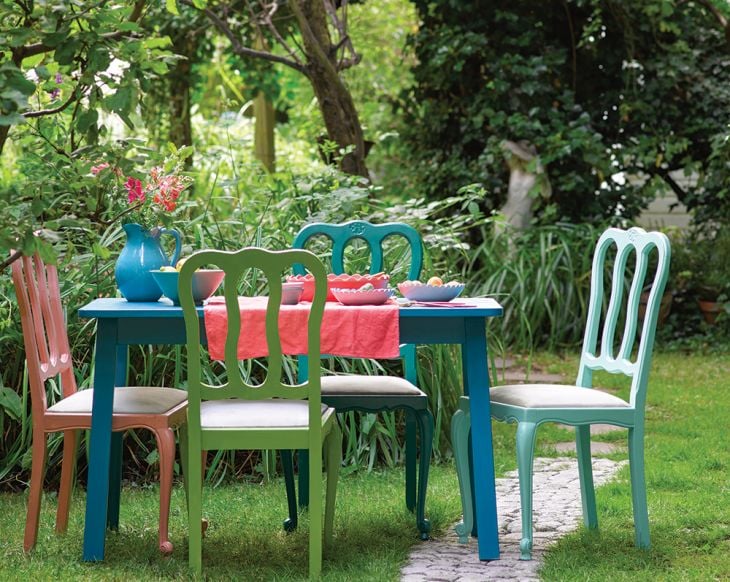
It’s a new season, and that means fresh inspiration for our homes – so where do colour trends come from? We asked Neville Nott, Crown Colour Consultant Ireland for the low-down.
“The ideas and concepts are based on research on furniture, textile and graphic design trends, often coming from Milan and fashion future forecasting,” he says. Each season, new colours and trends emerge, but there’s one over-riding theme to take note of for AW18.
“We’re moving away from painting everything in grey,” Neville reveals. “Now, we’re all about colour.” To get on board with the shades to try, we’ve identified four key trends.
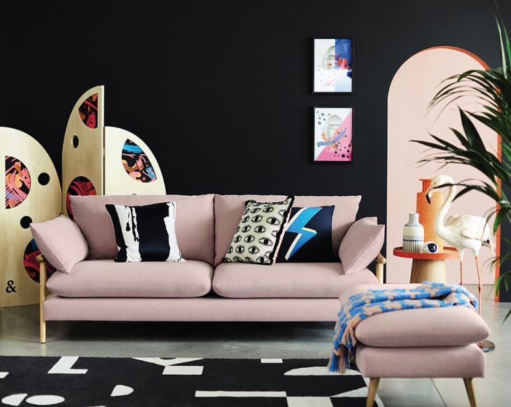
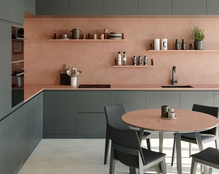
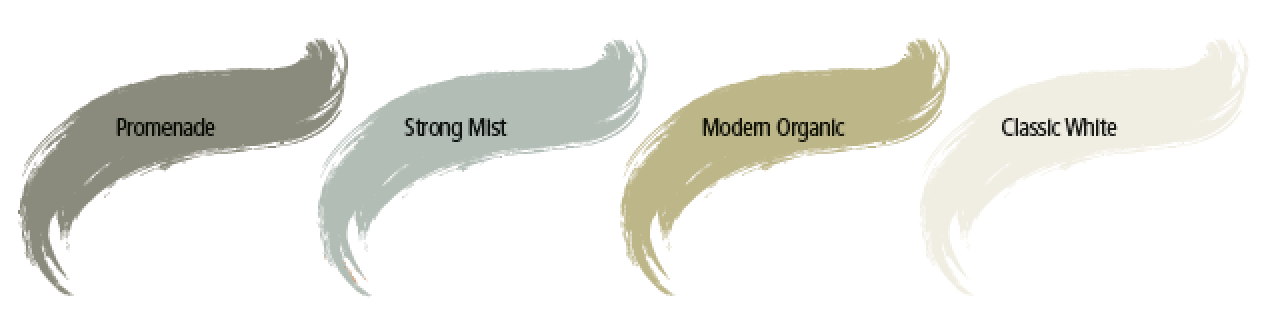
THE TRANSITIONAL TREND - NEW NEUTRALS
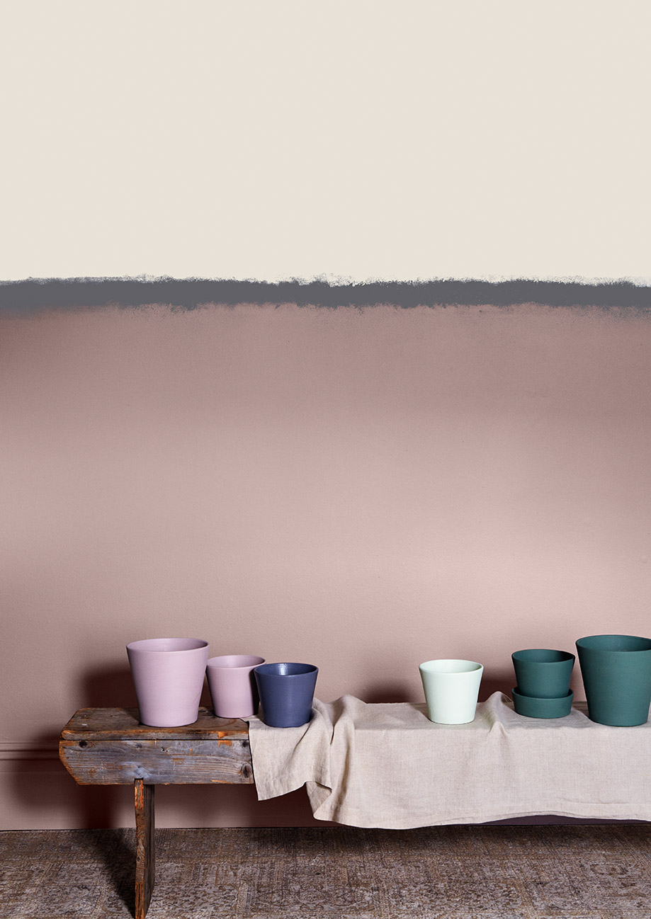
Want to ring the changes in a grey or beige living room, but don’t want to break the bank? “This is the next step up from grey,” Neville says. “It’s easy to use, looks great with neutrals and you can use it with your existing pieces, like a grey sofa,” he adds.
“This soft pink terracotta is almost like a make-up colour. It’s fashion for the home and something we’re going to see being built on this year and next,” Neville states. “It’s very soft and appealing. The nice thing about earth pigments is we’re grounded in them, and they’re what we associate with colour-wise.”
GET THE LOOK
This stunning look is impactful, yet easy to achieve, says Victoria Cairns, Crown Product Champion. In terms of product, “a matt emulsion works best,” she suggests, and as for how to approach your project, apply your top and bottom shades first. “Apply sufficient coats to evenly cover the wall (normally two, unless a mist coat is required for new dry wall). Avoid touching the two colours to avoid uneven finishes,” Victoria cautions.
Now you’re ready for your stripe. “Paint a horizontal line free-hand,” Victoria suggests. Use a 3” brush and make sure you cover the join where your two wall shades meet. “While the line is still wet, soften (or feather) the edges with a dry brush. Repeat for a second coat. If you’re applying over very dark colours an additional coat may be required,” she says.

THE NEW BOHO - CULTURED CELADON
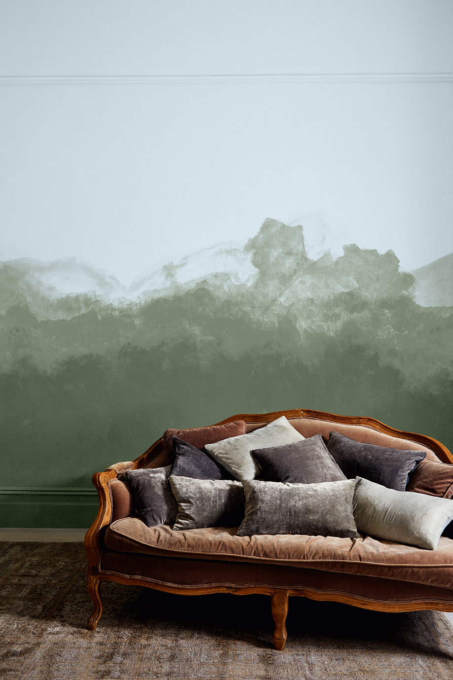
Boho is back, but don’t worry – it’s had a chic update. “There’s a huge trend towards going softer,” Neville agrees. “This grading works really well with vernacular and vintage furniture – it gives a contemporary edge.”
You might be surprised as to the inspiration here: “It was recycled plastics and fabrics – they have amazing colours to them, that washed out effect that the recycling process has on dye,” Neville reveals, adding, “it’s almost an unstructured ombré.”
Try this in a bedroom or a casual space, and don’t be afraid to try a new paint shade. “One of the great fears people have is how to use colour in the home,” Neville says. “We use paint to define our own personality and taste. Pick up colours and try them out; paint is an inexpensive way to try something – if you don’t like it, you can change it, and there are so many brilliant ideas on the Crown website – so take inspiration.”
GET THE LOOK
This trend tips a nod to ragging or sponging trends of old, but the use of an ombré effect and the subtle colour gives it a sharp contemporary update. So how to make it work? “Apply your background colour as normal – two coats with a medium pile roller,” advises Victoria. Next, decide where on the wall you want your washed effect to start and lightly draw in three to four layers. “Block them in with rags or natural sponges of various sizes, starting from the background (the highest layer) to the foreground (the lowest layer),” she instructs. “It’s important to keep going over each area to darken the effect as you move down the wall,” Victoria says – as this is what gives you the light-to-dark blended effect.
IDEAL FOR OPEN PLAN - THE BIG BLUE
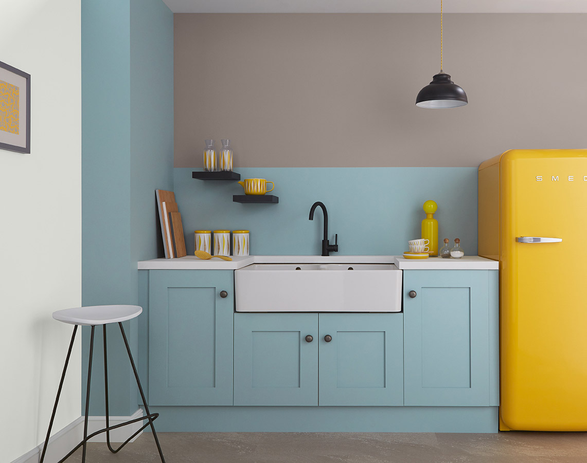
If you shy away from blue, now’s the time to try it. “This trend is all about blocking colours in different areas, which is a fantastic way to use space,” Neville says. “It’s superb in an apartment, smaller house, or in an open plan space because you can define areas using colour.”
What if you’re worried blue will be too cold? It’s all in the shade you choose. “Blue is a big trend – the darker the better – with ink and midnight blues,“ he notes. And if you want a warmer-toned hue, ask for a colour that has ultramarine tones.
Blue is versatile too – “you can introduce pops of colour – use a pink with a duck egg, that’s fantastic,” Neville says, “or if you don’t feel like painting the whole room blue, paint your architraves in an off-white, and it will look beautiful and classic.”
GET THE LOOK
Blocking of colour to delineate zones within a room or an open plan space requires precision. Mark out each zone you want to paint with tape to ensure a clean finish and sharp lines, before blocking in each of your shades using a medium pile 9” roller to fill larger areas.
On corners, alcoves and the spaces around architraves, skirting and wall fixtures, use a 3” brush. Long, smooth strokes are best, matching the thickness of the rolled paint.

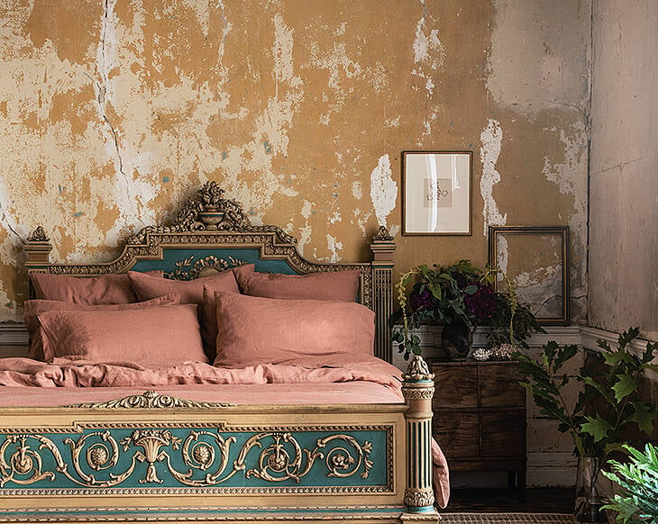
BEDROOM BLISS - ECLECTIC DREAMS
Nope, dark décor doesn’t have to stay downstairs in your social spaces. “The concept here was a midnight garden,” Neville reveals. “We were looking at photographs of a summer garden at dusk, so this is all about darks, blues – and in a moody bedroom this would look fantastic.”
Combine these tones with deep dusty pinks or organic colours, says Neville, and you’ll be onto a winner. The softened lighting effect isn’t as difficult to do as you might imagine, either. “It’s freeform, done with a brush and has less contrived edges – we’re moving away from very linear designs,” Neville notes.
GET THE LOOK
Victoria Cairns, Product Champion, says this is all in the prep and is best used on a feature wall. “Paint the wall in two coats of your lighter colour, allowing it to dry,” she advises. “Next, block in your dark shade, using a medium pile 9” roller to fill larger areas, before switching to a 4” mini roller, which will help you outline the edges of your streak.”
The advantage is that because you’re making an organic shape, it doesn’t have to be too perfect. “Make sure you keep a wet edge when swapping rollers,” Victoria cautions, “and blend the two areas at the joins to minimise visible roller marks.” Finally, tidy up your lightning bolt with a brush using your darker colour, to get the perfect finish.