We've had the years of greenery and ultra violet from Pantone, but Dulux are getting in on the action early for their 2019 Colour of the Year.
Announced yesterday in London, their expert panel of colour designers, design specialists, trend forecasters, architects and editors from around the world have chosen Spiced Honey for the title.
The panel believe as we move into 2019, people will be re-energising and awakening - that we are ready to 'let in the light'. The warm and inviting amber tones of Spiced Honey reflect this perfectly. "It can be both calming and nourishing or stimulating and energising, depending on the palettes and light surrounding it,” says Heleen van Gent, Head of the Global Aesthetic Centre, who chairs the ColourFutures™ panel annually. “The contemporary hue is versatile, sophisticated and timeless and lends itself to a broad spectrum of life and interior styles - perfect for reflecting the universal mood encapsulated by the panel."
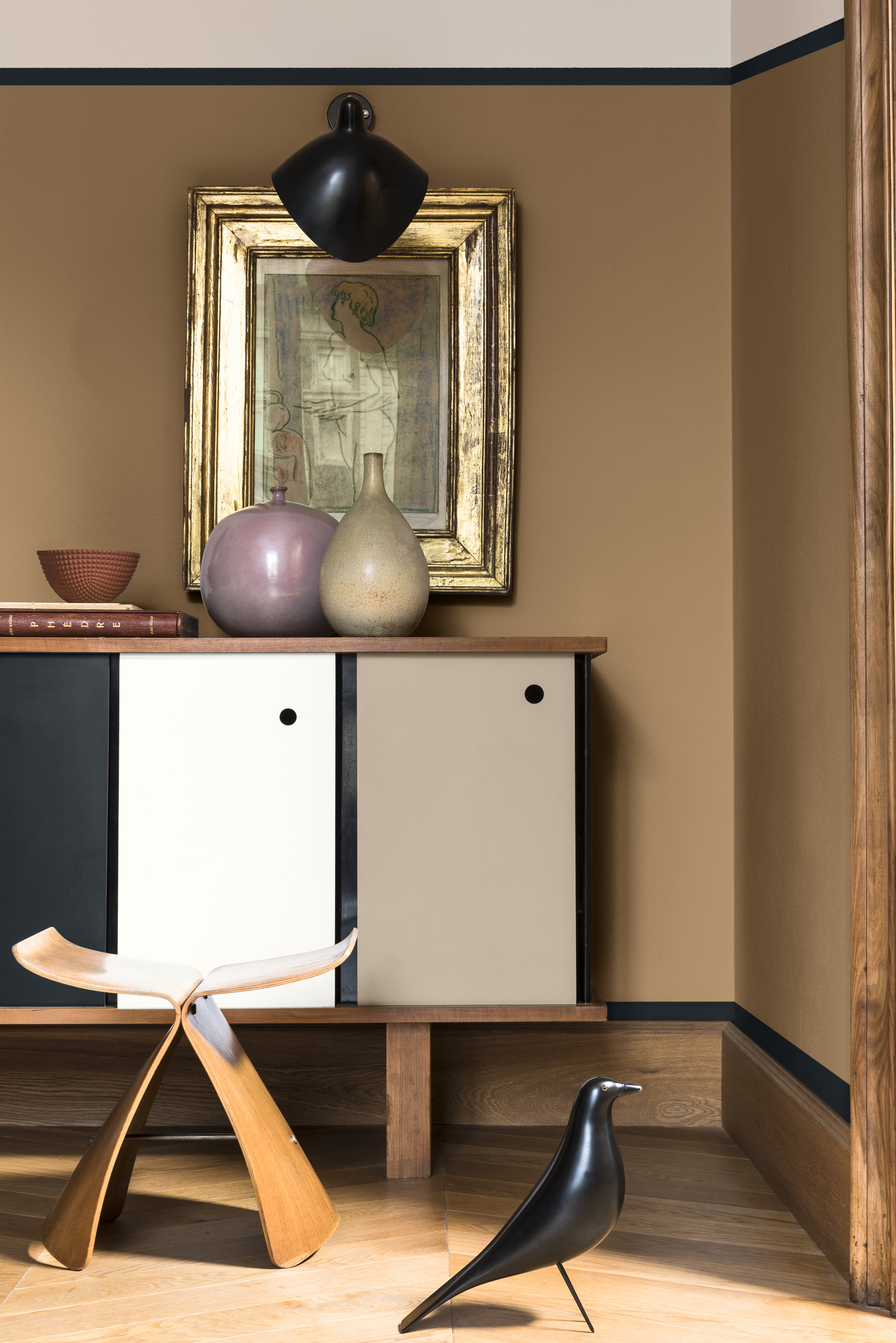
"It’s time to act and Spiced Honey enables transformation inspiring a positive, emotional change,” says Marianne Shillingford, Creative Director for the Dulux brand in the UK. “Spiced Honey has a raw, natural quality that works like a warm neutral, which makes it so adaptable to pairing with different materials and styles of decoration. Its rich caramel tones visually turn up the thermostat a few degrees and so it’s perfect for creating a relaxed cosy atmosphere in places where we like to think, dream, love and act. It looks especially good when teamed with whites and off whites in furniture and furnishings which gives it a contemporary feel.”
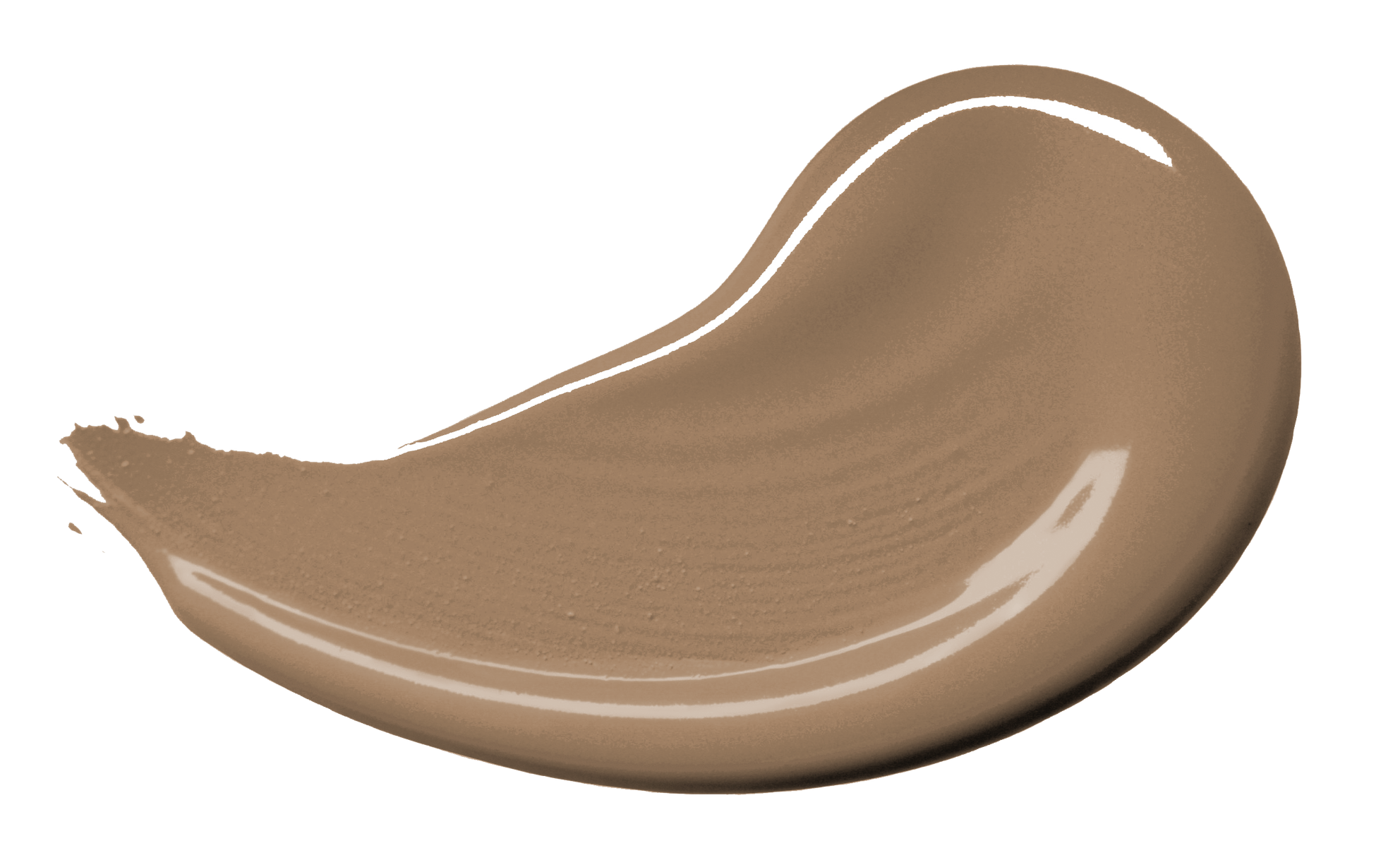 Dulux Spiced Honey
As well as choosing Spiced Honey as the 2019 Colour of the Year, the panel also created a set of colour palettes from the insights they had pulled together. All the palettes include Spiced Honey, and have been designed to help make integrating the lead colour into your decor simple. "The colour palettes tell different stories of colour and the way we will be using it in our homes in the year ahead. Think, Dream, Love and Act are the trends that capture a new spirit of resilience and optimism in a world that had us retreating to our homes and hiding behind the sofa in 2018," says Marianne.
The palettes are:
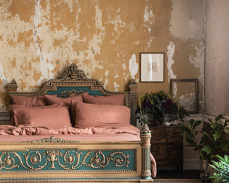
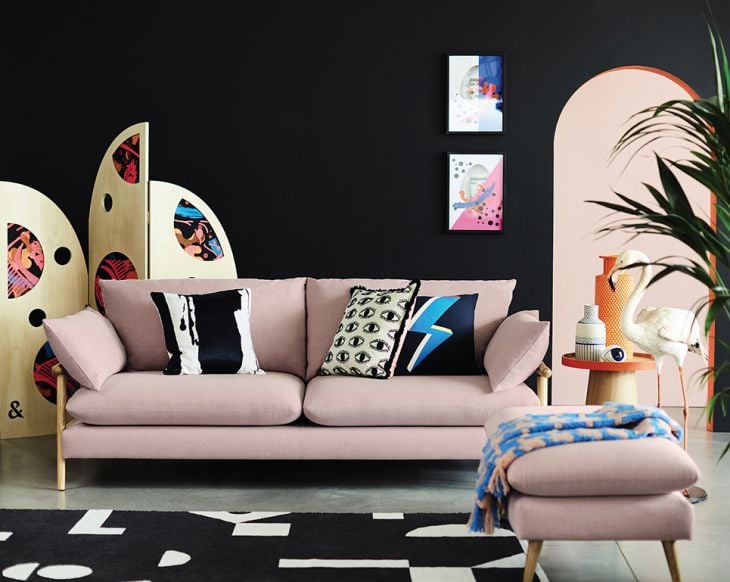
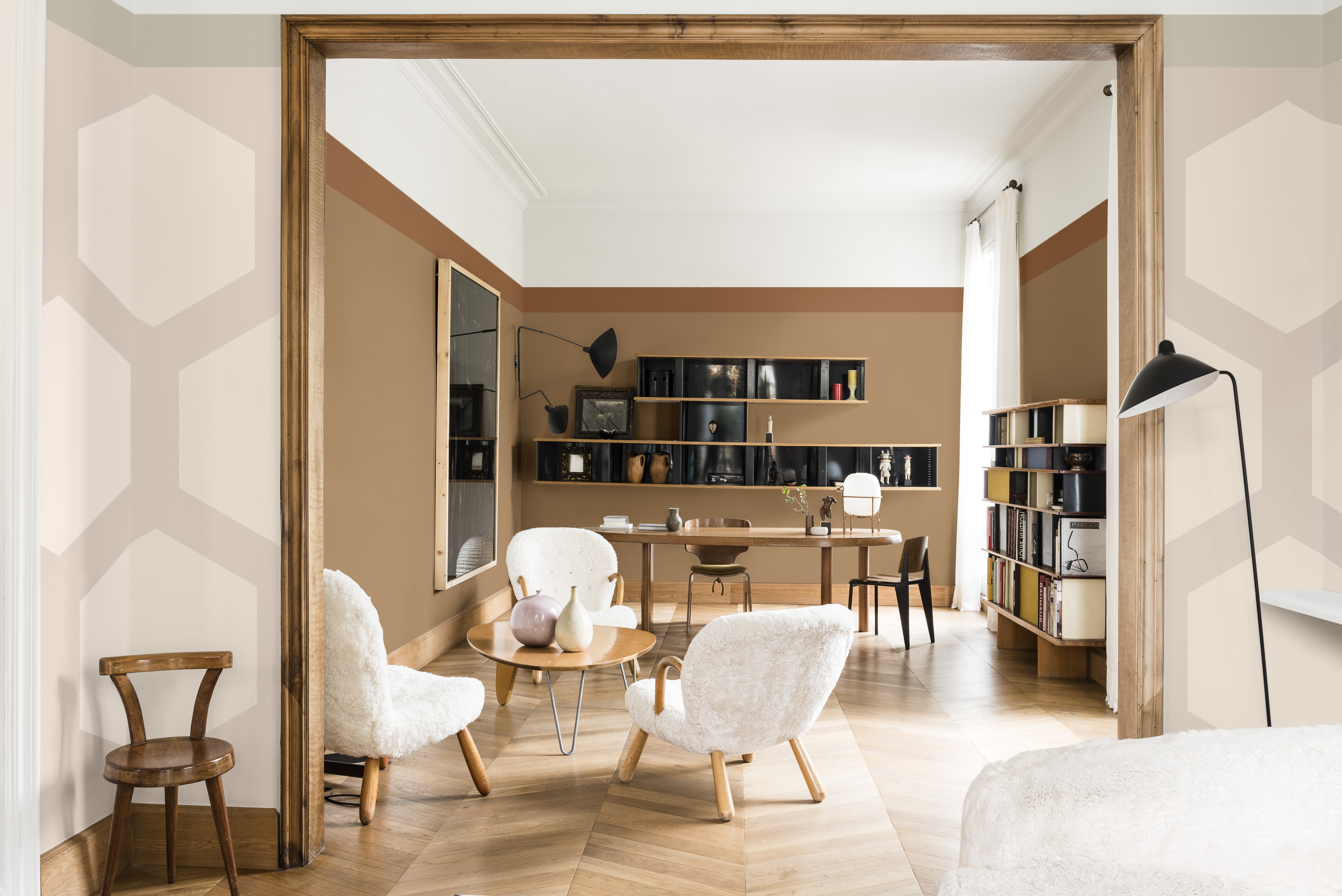
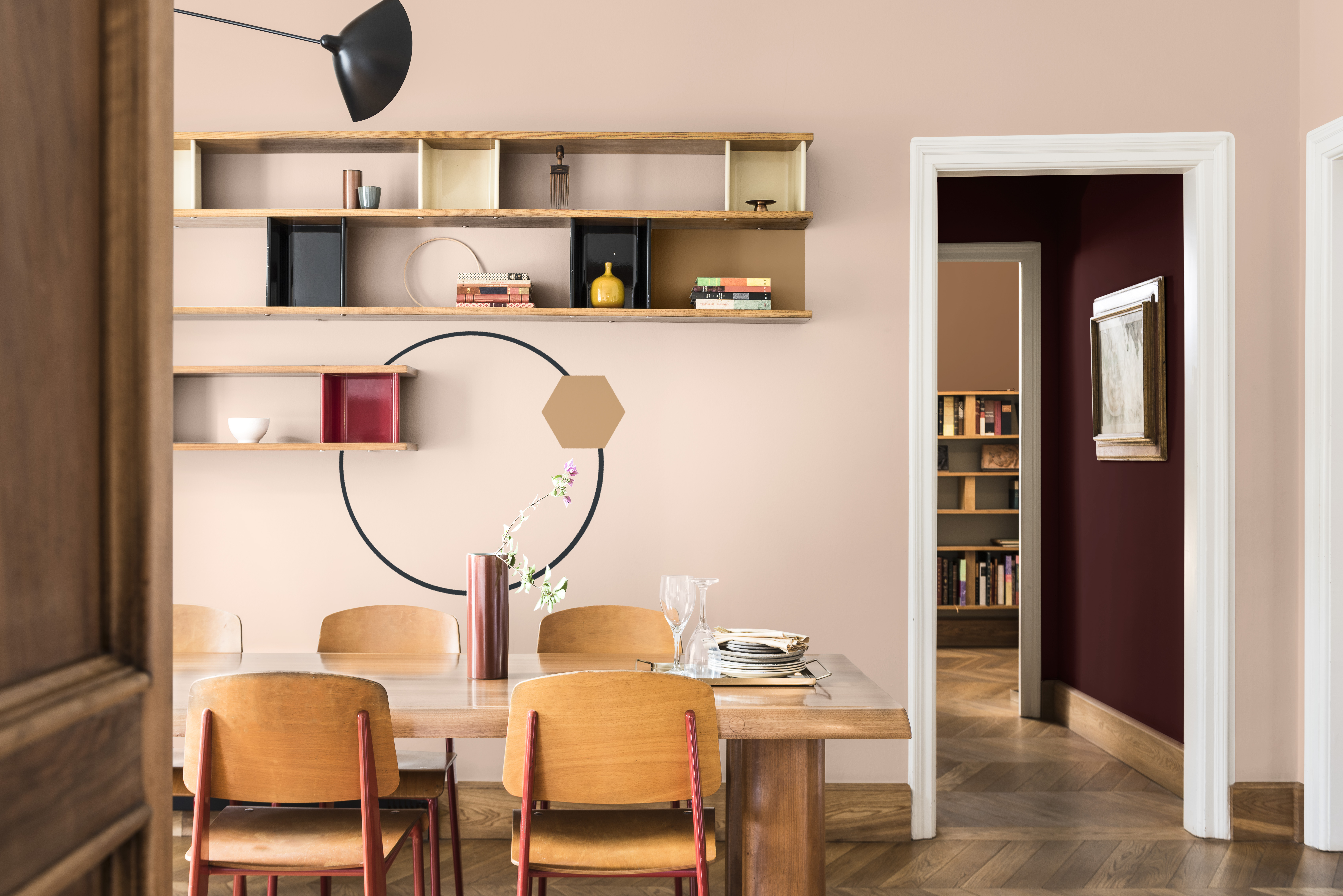
'Warm Neutrals' - Includes rich neutrals and soft pinks, intense burgundy and sophisticated deep blue. Pairs well with polished woods, mid-century style, graphic rugs and textiles.
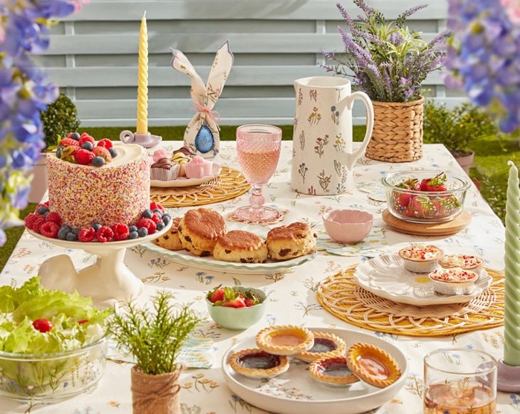
'Soft pastels' - Gentle muted mix of romantic powder pinks and blues, to create calm. Pairs with plain, pale woods, simple hand-thrown vessels and pretty fabrics.
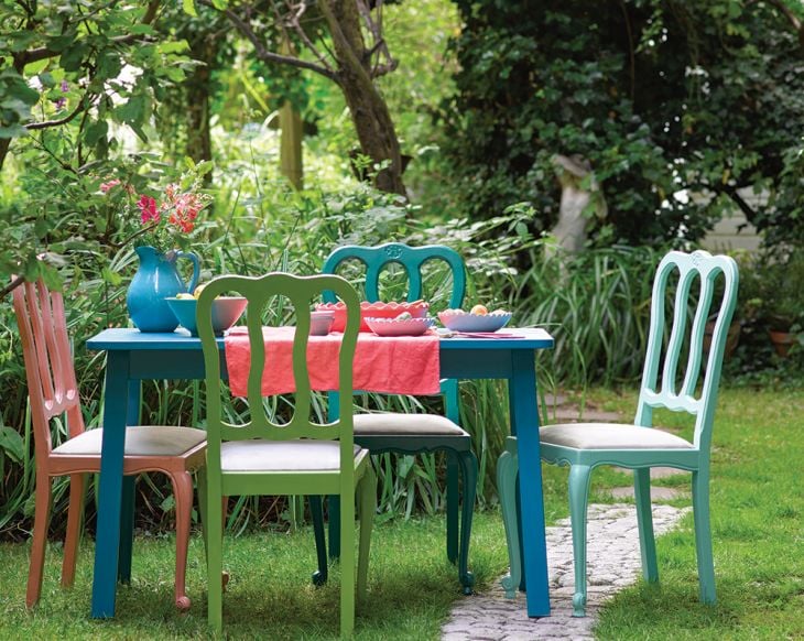
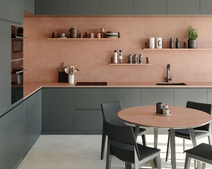
'Intense pigments' - The warmest palette, filled with richly pigmented shades like deep forest green, bold teal, and intense terracotta red. Pairs well with wooden furniture and botanical prints.
'Bold brights' - A playful palette with pops of vivid red and green, among pale pinks and blues, and crisp greys and whites. Pairs well with reclaimed, personalised furniture and bold graphic shapes.
You might also like: PPG's Colour of 2019 is another you're gonna love!