
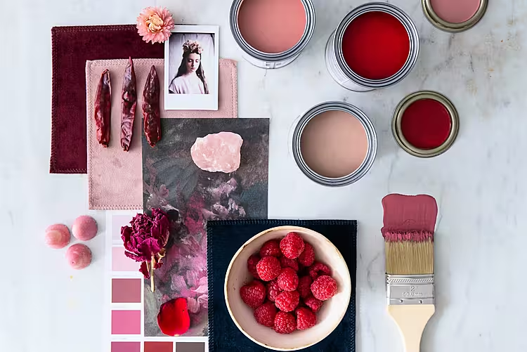
Today we're introducing you to the final chapter in our colour journey with Crown Paints. The palette is called Dark Fruits and we reckon it's the most festive, cosy palette to celebrate this time of year.
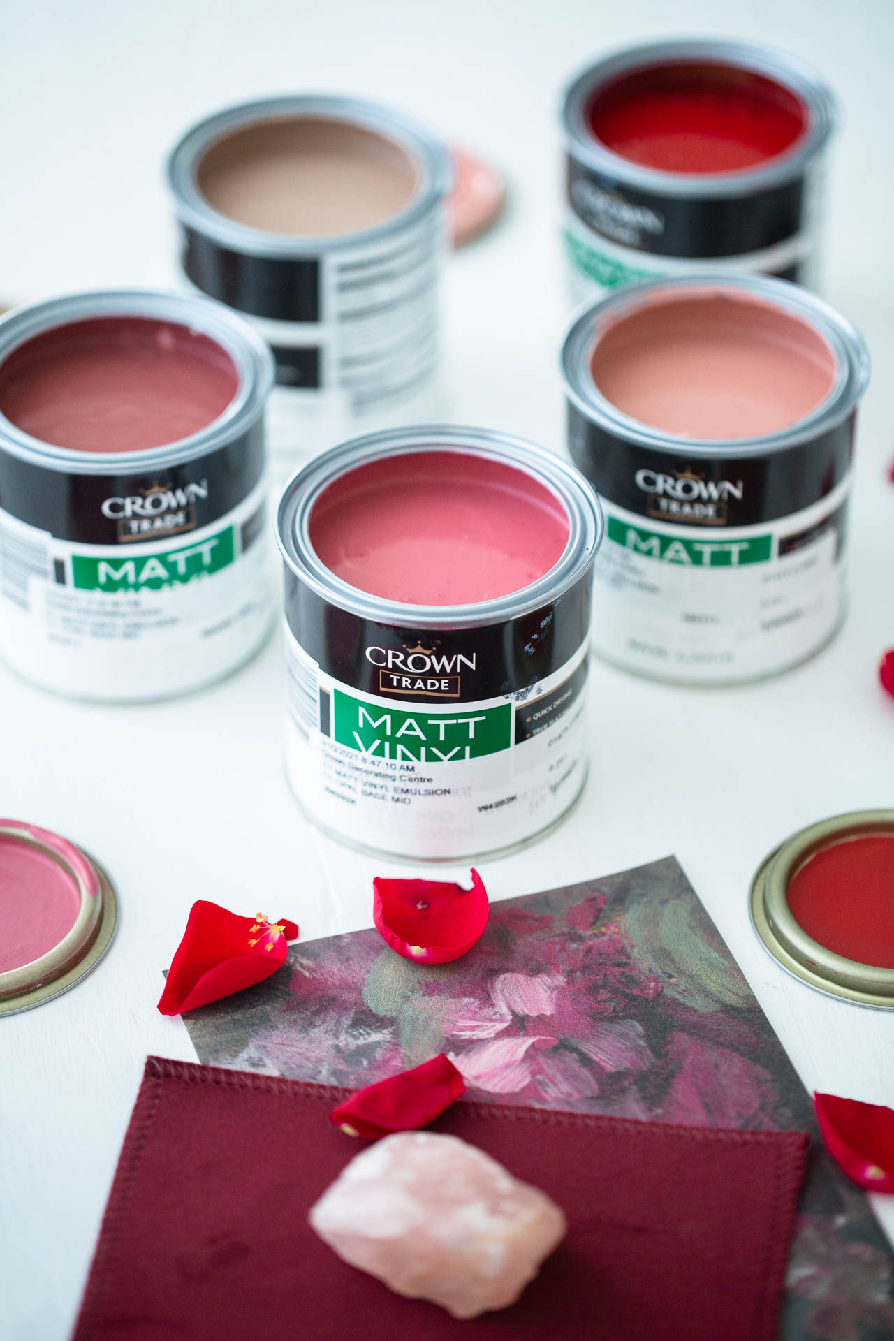
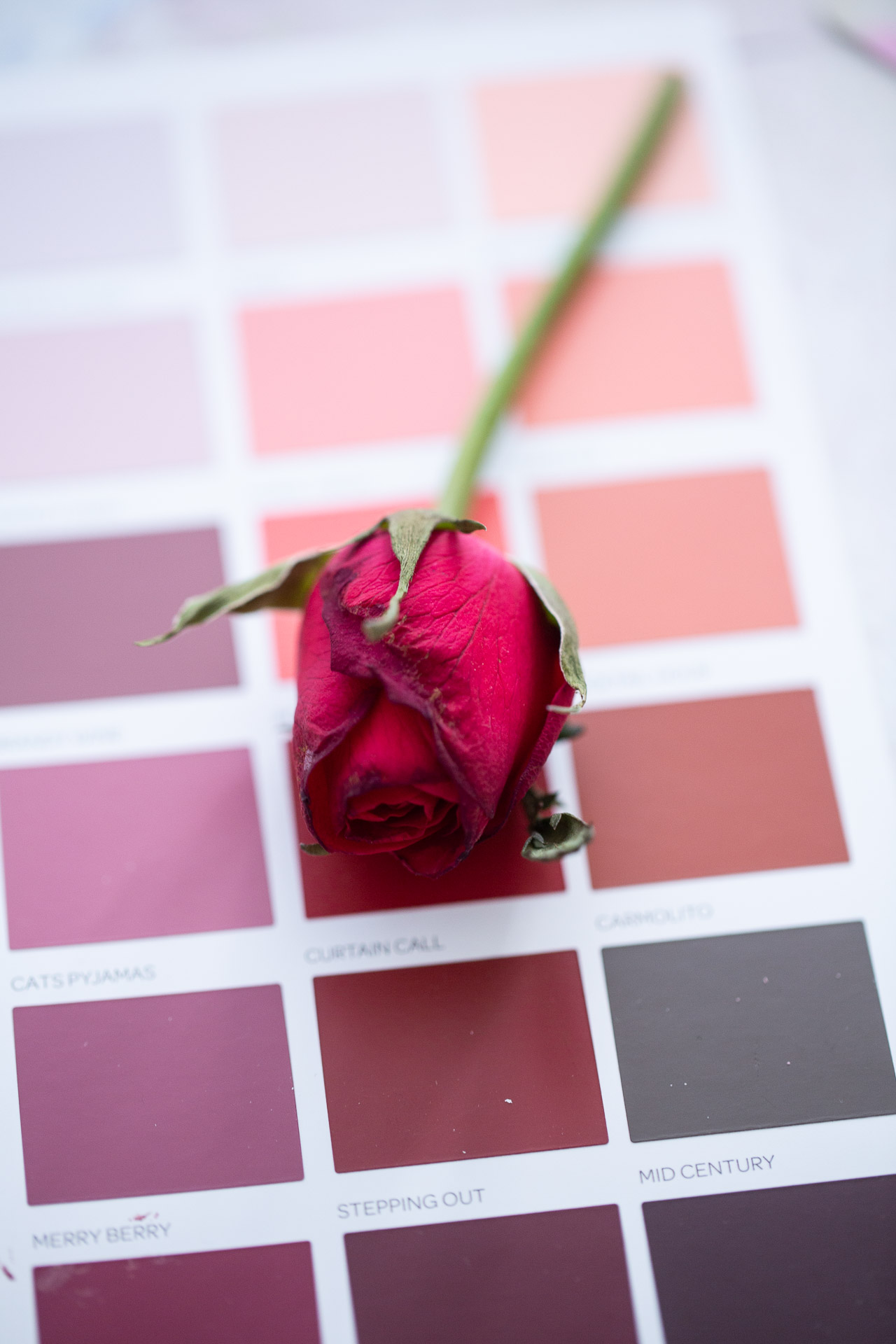
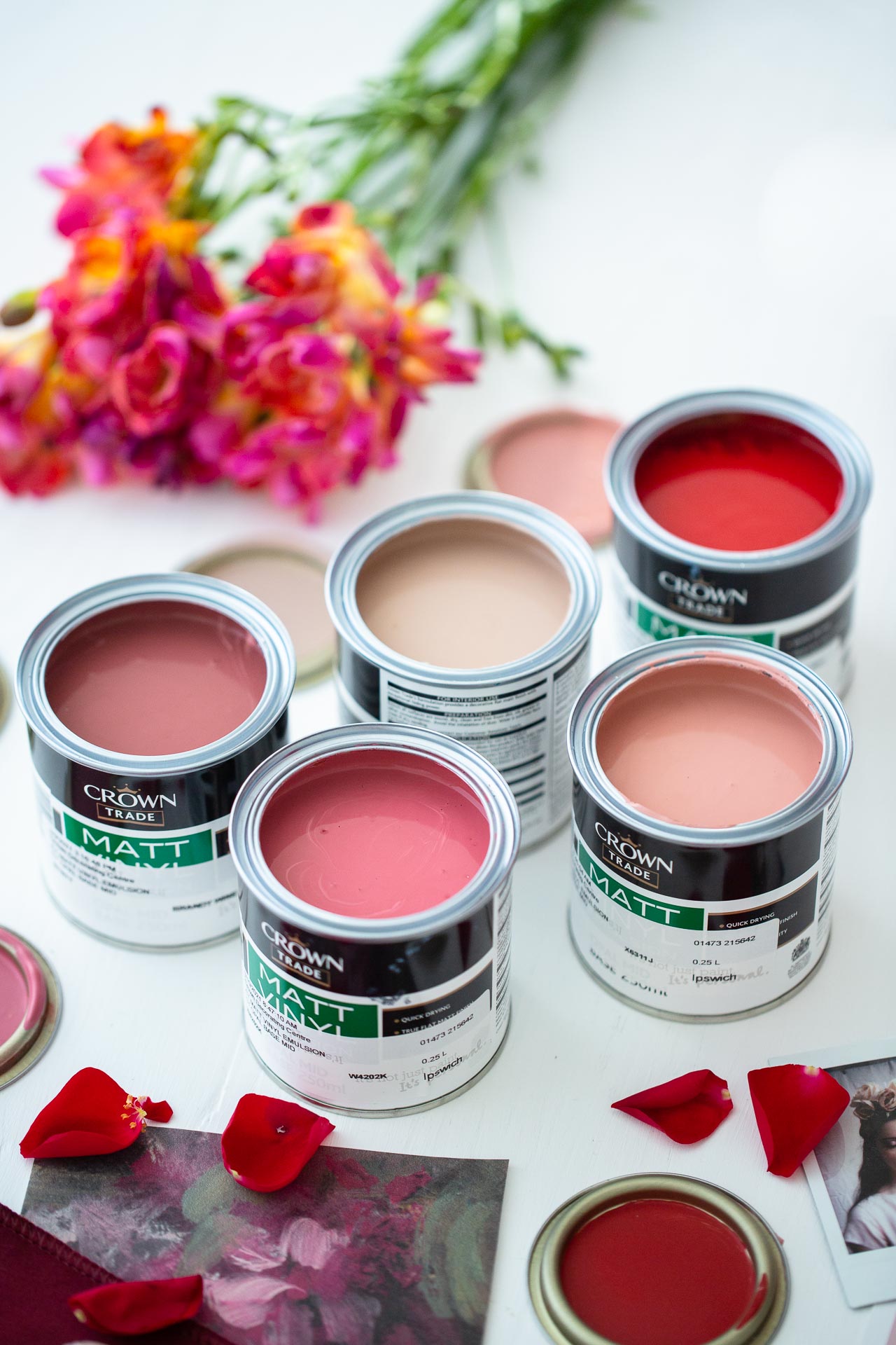
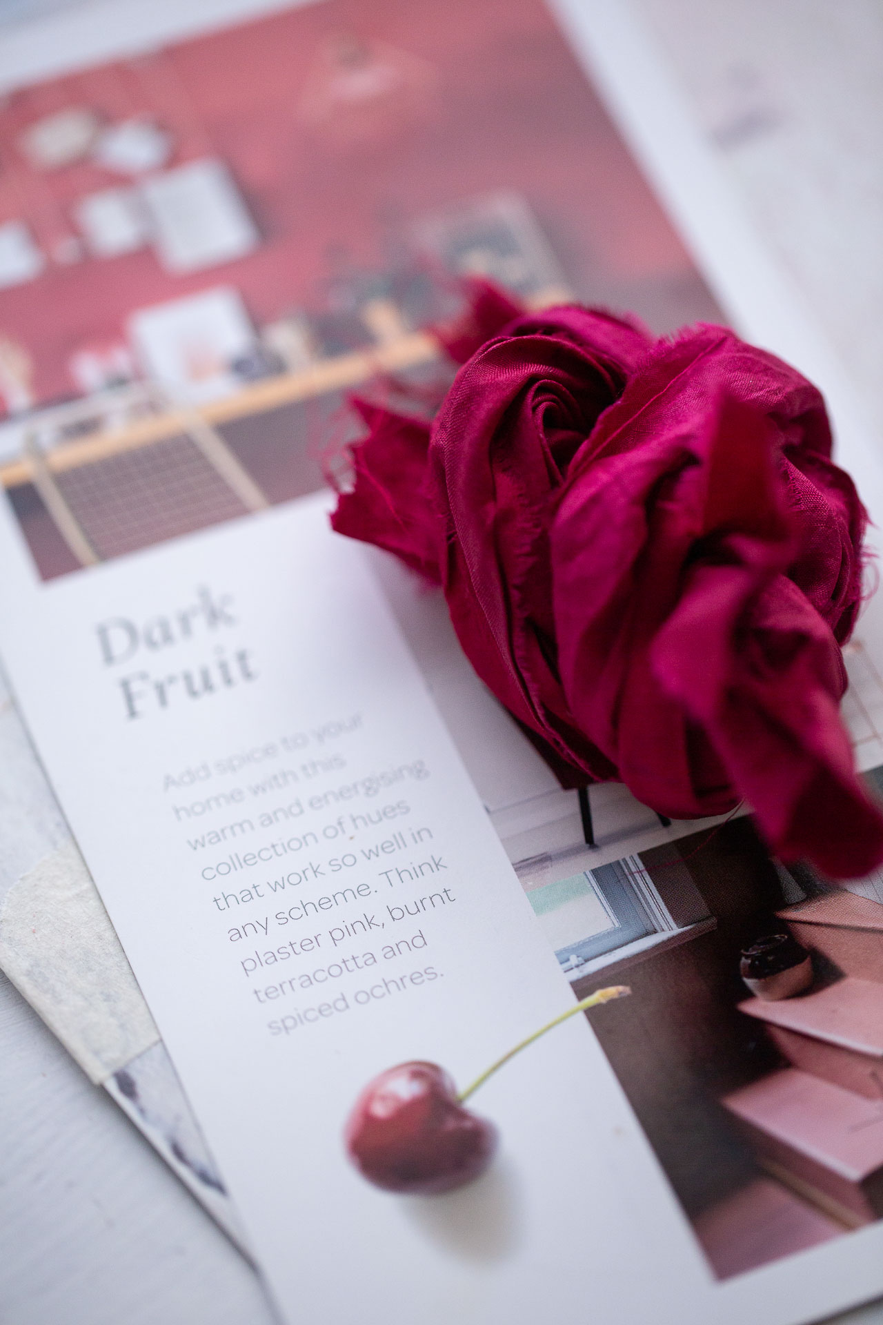
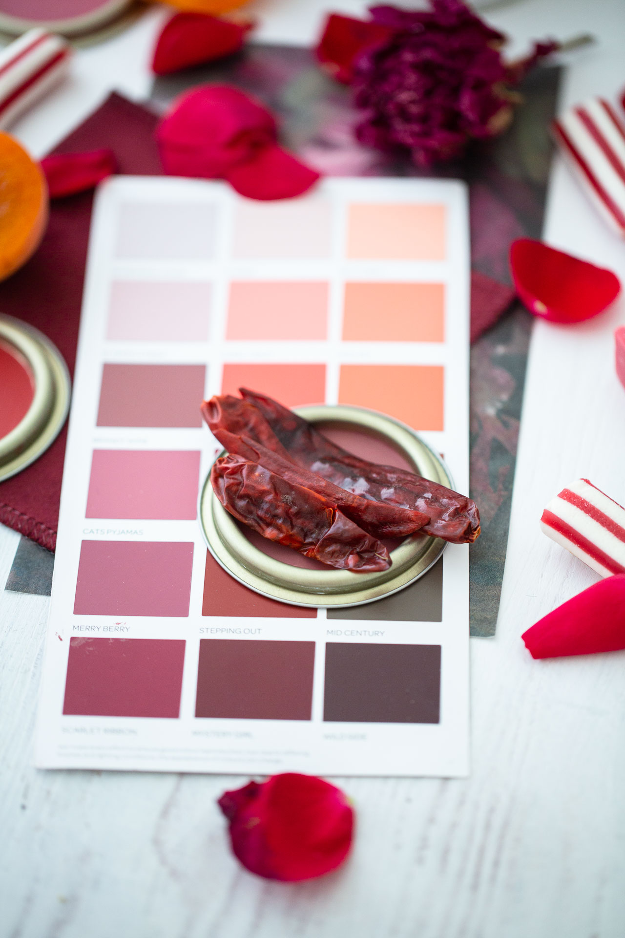
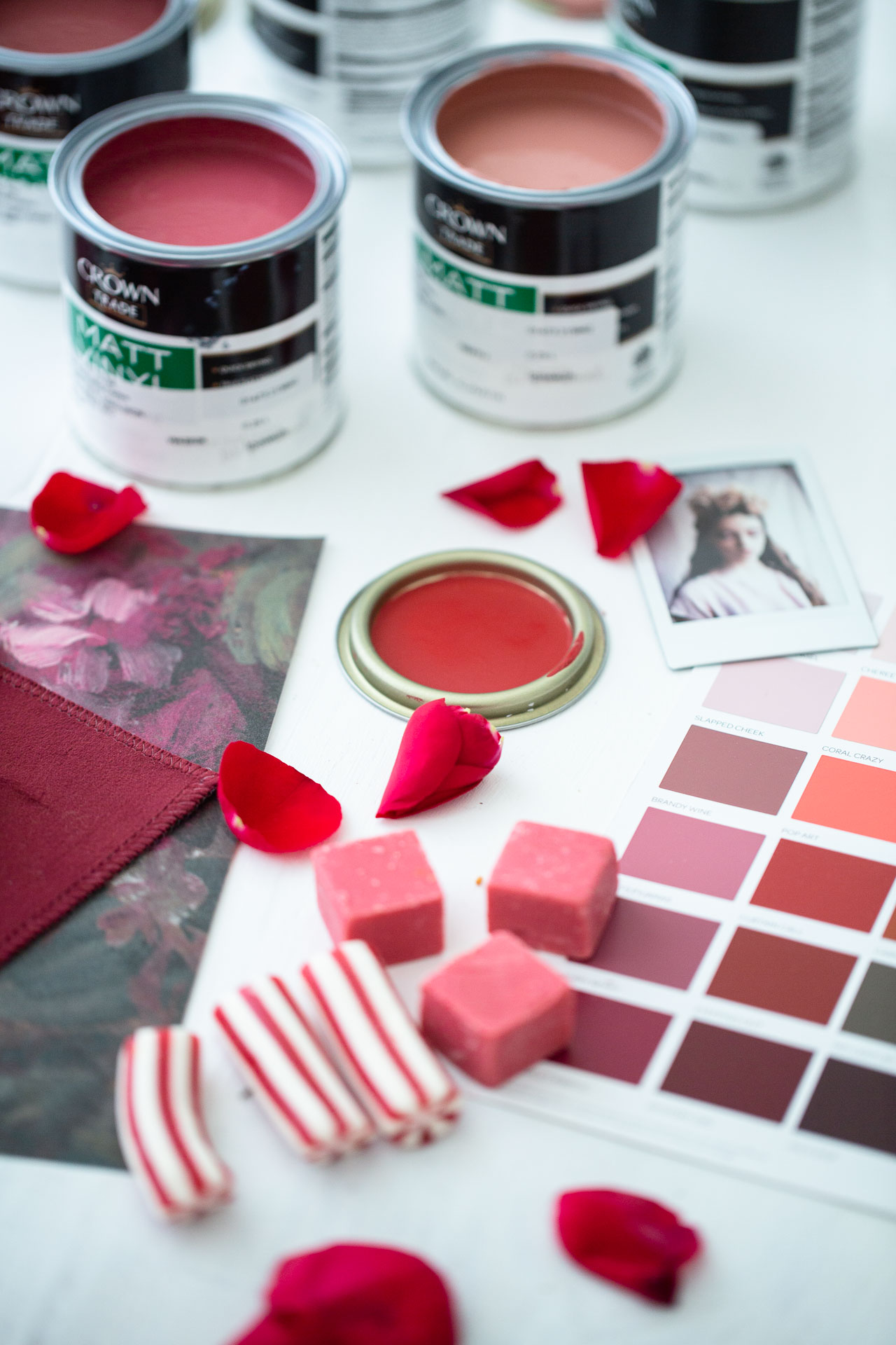
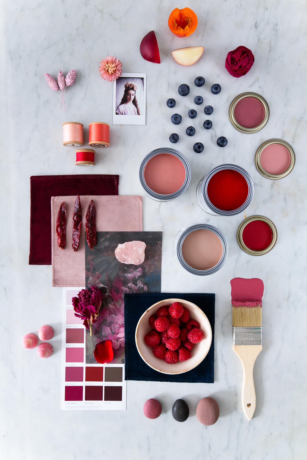
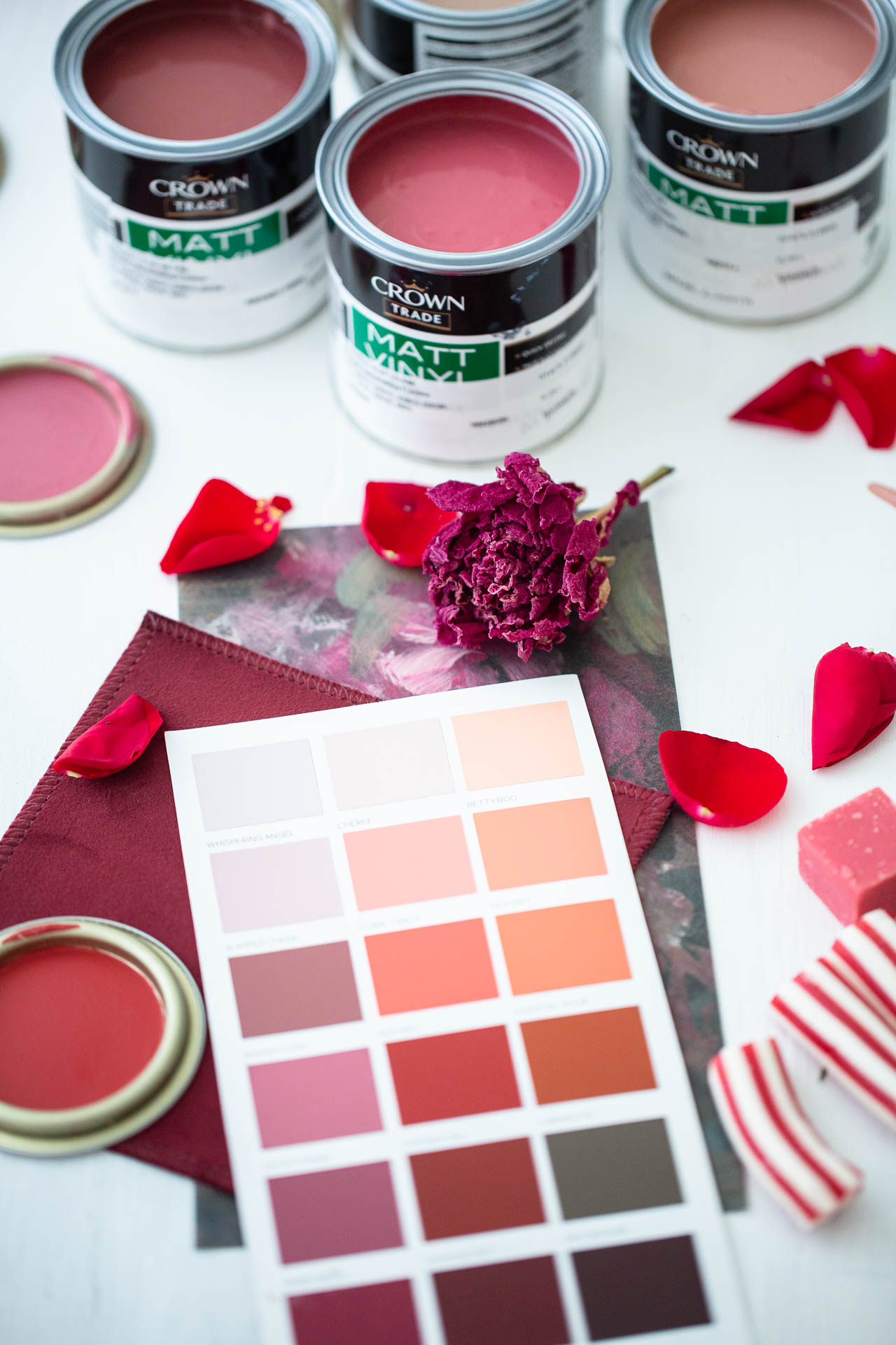
THE DARK FRUITS PALETTE from our Moodboards collection encompasses earthy reds, browns and mustards. The palette is designed to be inviting, warming and- thankfully after the year we've had- calming. The rich colours included, such as plaster pink, burnt terracotta and spiced ochres, add a spice to the palette and work well with creamy neutrals as well as balancing greens.
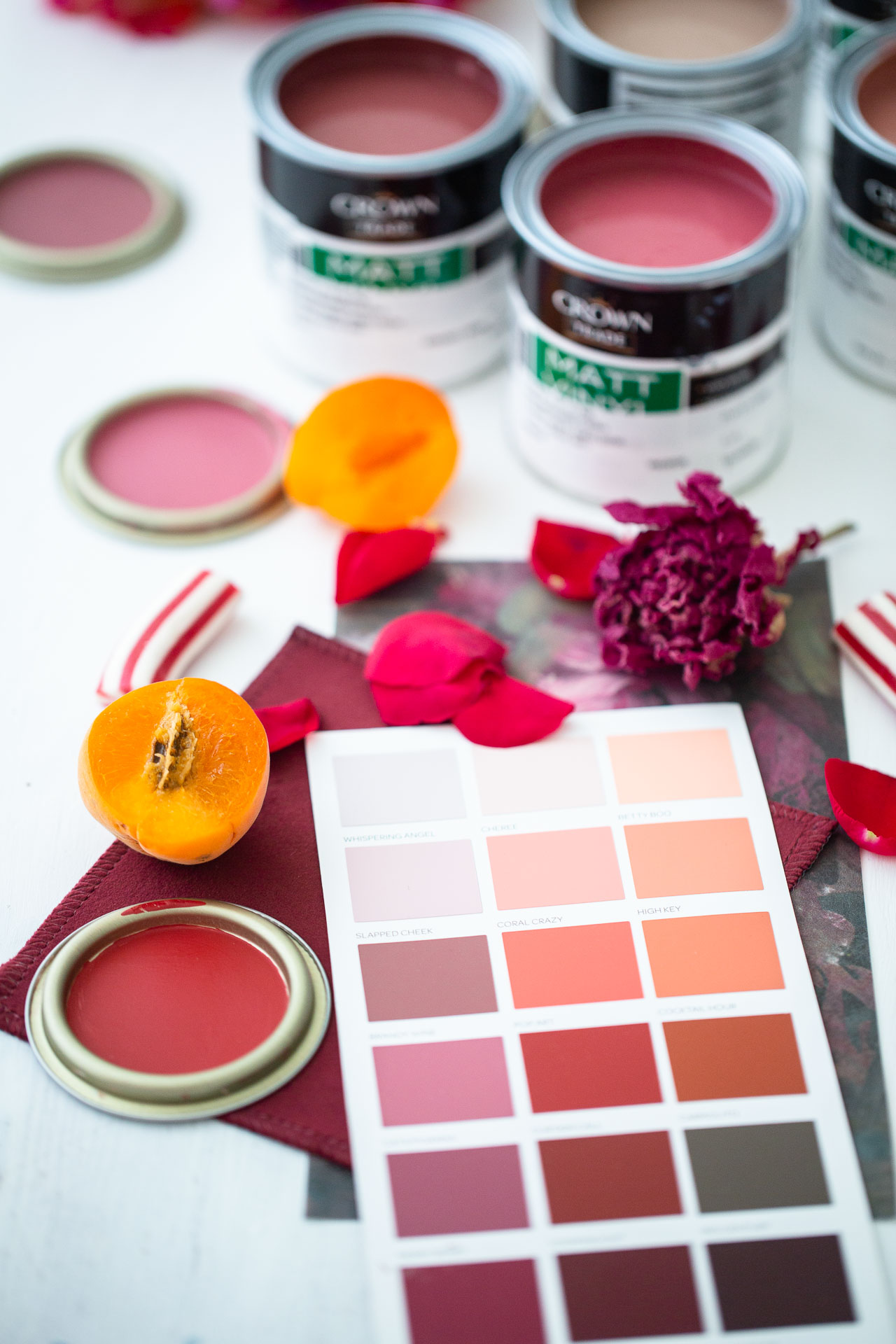
When developing this palette, we wanted to create tones that users wouldn't shy away from, and instead embrace the boldness of red in any room of the house. We have pinky tones that are gorgeous for a bedroom, corals for a playroom, and dark reds that evoke all the right emotions for the dining room. Red is known to encourage appetite, socialisation and passion- so use accordingly!
When asked about using reds in her designs, Roisin Lafferty, Founder and Creative Director at Kingston Lafferty Design had this to say;
"Red is a colour I am beginning to see more of. I was venturing into maroons and burgundy hues but am definitely being drawn to primary red. The wonderful Pierre Yovanovitch has such a wonderful eye for colour combinations. He is very much in the limelight on Instagram and Pinterest and I think his example will encourage people to take the leap."
"I think what the pandemic will do, is encourage people to make their home a space they love. In a positive way, I think people will become more expressive and more willing to showcase their own personalities and wants. We have never been in a situation like this before. Now more than ever, we need to create environments that warm our hearts and make us happy, so I think people will be using a lot more colour than before," Roisin continued.
"Jewel tones and bold brights will continue to be prominent in response to minimalism", adds Elaine Verdon of Leo and Cici.
As we mentioned, according to colour psychology, red stimulates the appetite and creates a sense of energy and enthusiasm. This is why it's used so often in food and restaurant logos! Coca Cola, McDonalds, Kellogg's, KFC and Irish restaurant chains such as Diep and Eddie Rockets all use bright red in their logos. Moreover, many restaurants will use red in their interior design. So if you're designing a commercial food space and you want to get food in bellies, a hunger-inducing red is a good shout.
"Red and purple can be strong and striking which often feels right for spaces that we don't spend a lot of time in, for example restaurants or places that want to make a statement. I understand and relate to these colours in a commercial setting more so than in a home but then again colour is subjective", explains Reena from the design blog Hygge for Home.
“If you had asked me a month ago I would have said that the colour trends for this year and next would be muted earth tones with warm rusts, peaches, dusky pinks and burnt ochres... But now because of pandemic I think people will be looking to a brighter, mood-enhancing, cheerful palette to lift their spirits - so think vermillion and cherry reds, hot pinks and oranges with sunny yellows. I hope the rainbow effect will impact in peoples homes now and in months to come," says Artist, designer and influencer, Lucy Tiffney.
Here's hoping!
We hope you love using this collection as we loved making it. If you do, please tag both @houseandhomemagazine and @crownpaintsireland on Instagram and use hashtags #moodboardsIRL and #togetherwearebrilliant. And don’t forget to check out the other colours in our Crown Paints collaboration here.
Crown Moodboards collection is available nationwide.
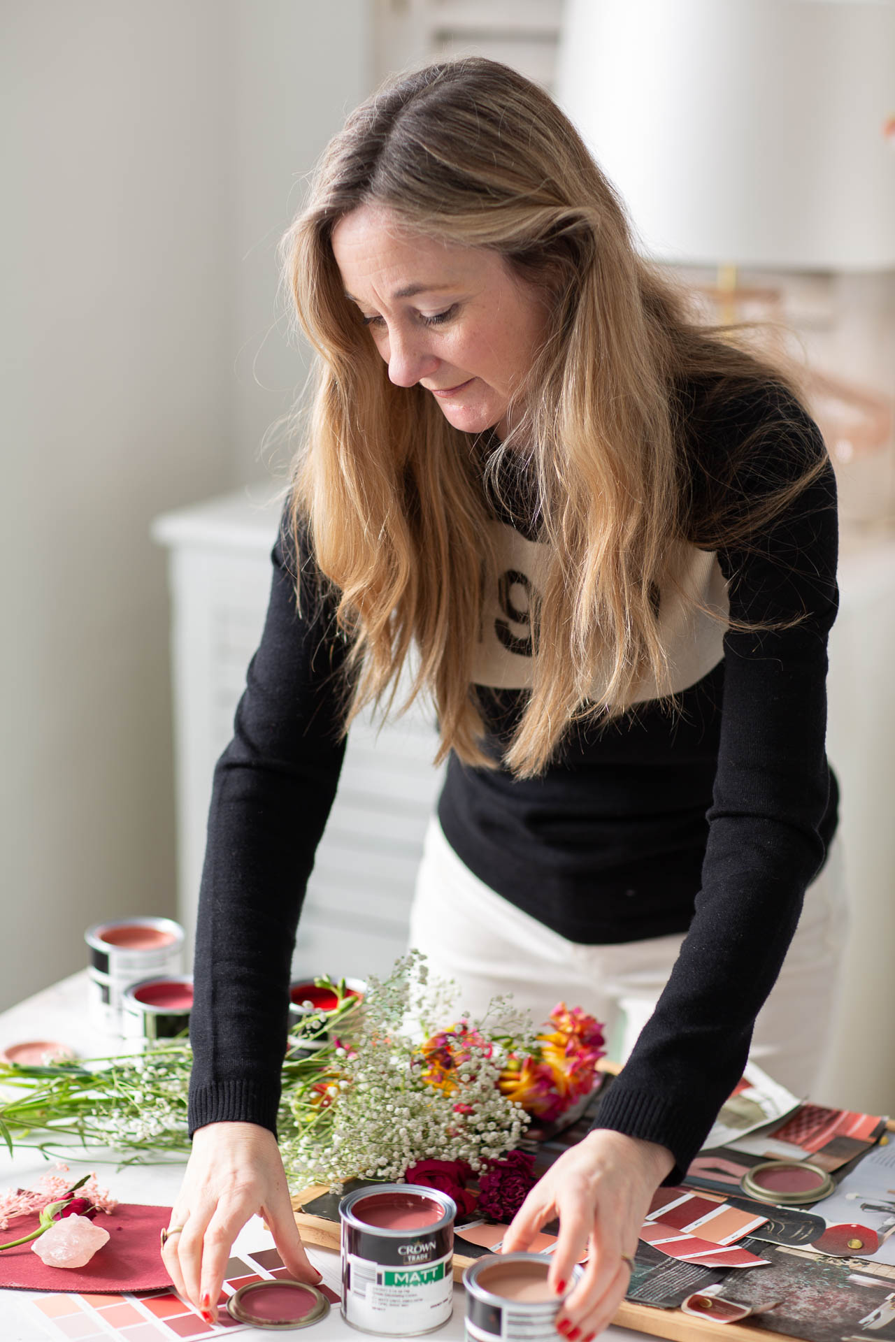
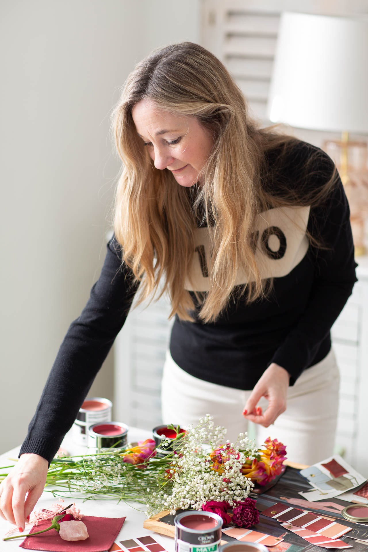
Styling by Ciara Elliott
Photography by Tamsyn Morgans
Videography by Poppy Bertram


