
Over the years, we’ve been so inspired by the homes we’ve come across when photographing our editorial features, or when admiring the craftsmanship of artisan makers. We’ve often seen a beautiful mug pottery mug and thought “This colour is so relaxing, I’d love to paint my bedroom walls this colour”. But found that that perfect shade doesn’t exist in the paint aisles of hardware stores.
So last year, we teamed up with our friends at Crown Paint to remedy that. We said “Wouldn’t it be great if we could have a range of colours that reflect the sweet moments of everyday life?”
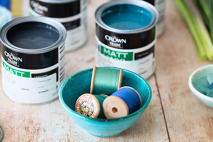
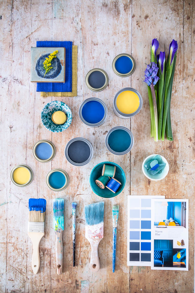
So, we pulled that favourite mug out of the cabinet, and gathered spools of threads we found in our granny’s sewing basket. We went outside and photographed the moss in our nearly forest, and the reflection of a sunny day in our garden pond. We took photos and arranged the shots into colour stories.
Our Editorial Department compiled cut-outs from stacks of our beloved magazines; hues of green inspired by a home we visited for a magazine feature that we felt instantly relaxed in. Cheerful yellows that have made otherwise stressful home offices feel uplifting. Sensual berry shades in a dining room that mirror the glasses of wines enjoyed there.
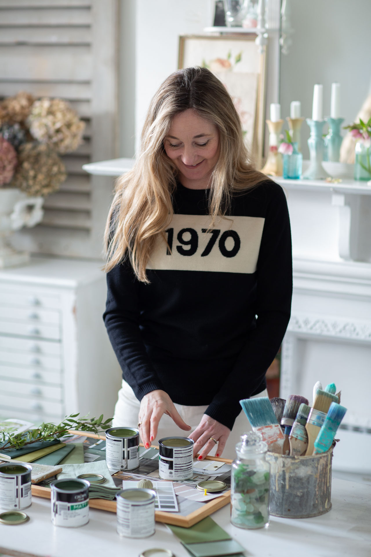
“In order to come up with Crown ideas for colours I initially started with colours and ideas that I was drawn to. I also started to ask the interior design community what they liked, and also interviewed a number of them as well as interior design tastemakers and bloggers on their thoughts. I then collated with colour forecasting trends to come up with the five key palettes which I put on raw moodboards which I presented to Crown”, explains our Editorial Director, Ciara Elliott.
And so, given the process involved in the creation of this collaboration, it made sense to call it Moodboards. The collection of colours developed are the moodboards of the everyday instances that we’ve spent years celebrating at House and Home. We were happy to align our ethos with Crown, whose tagline is “It’s not just paint… It’s personal”.
We caught up with Róisín Lafferty of Kingston Lafferty Design to gage her thoughts on the importance of colour; “I think what the pandemic will do, is encourage people to make their home a space they love. In a positive way, I think people will become more expressive and more willing to showcase their own personalities and wants. We have never been in a situation like this before. Now more than ever, we need to create environments that warm our hearts and make us happy, so I think people will be using a lot more colour than before.” We couldn't agree more.
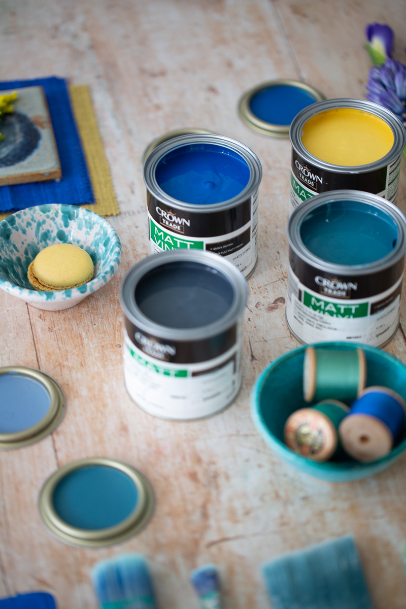
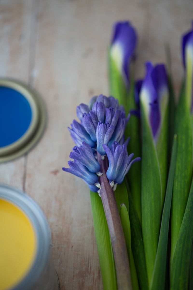
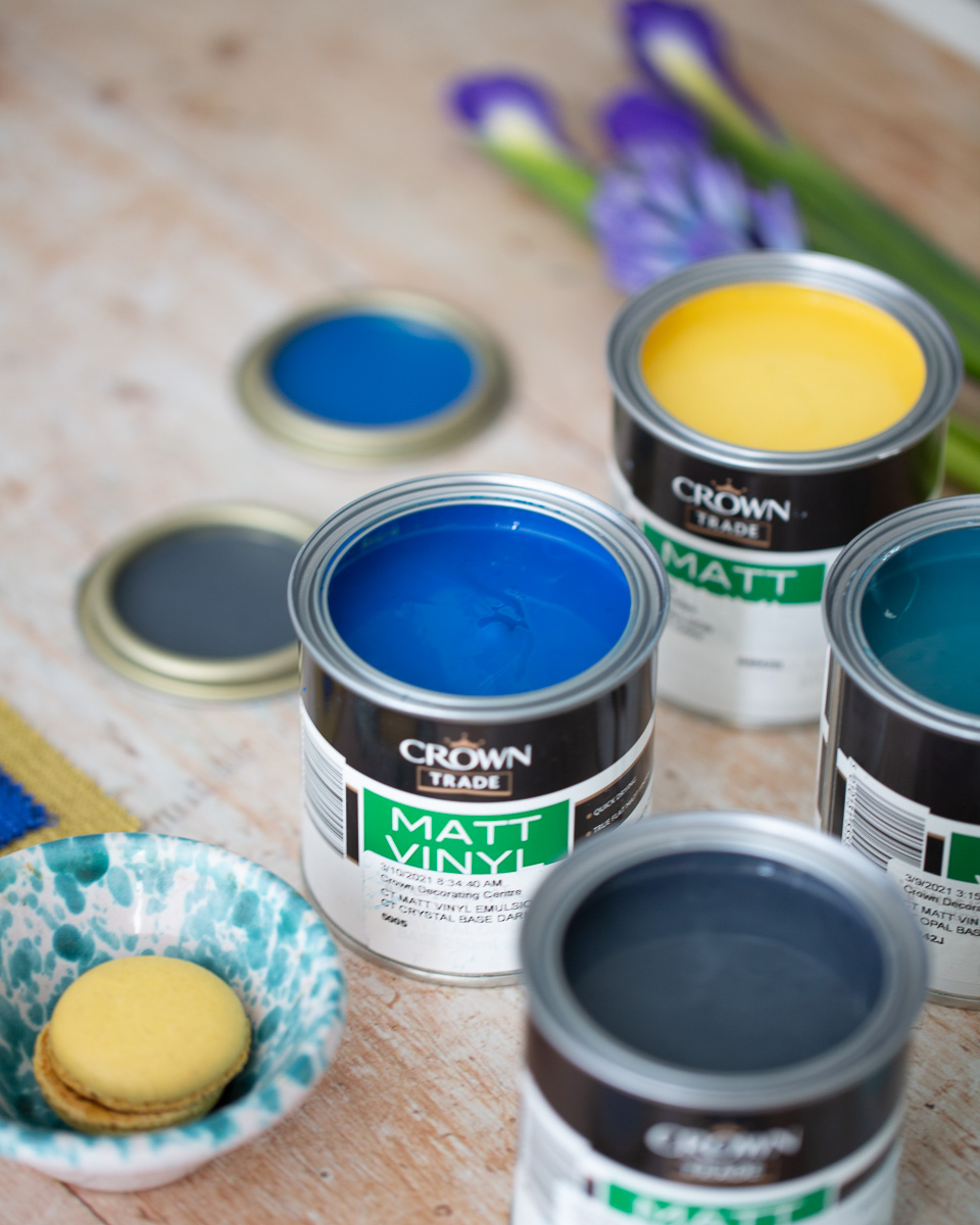
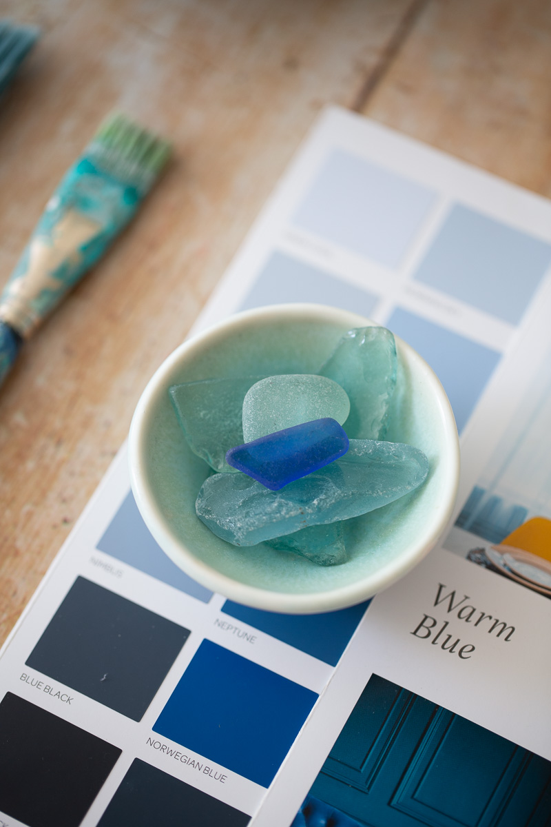
We’re super excited to show you one of our favourite colour stories from the Moodboards collection; Warm Blue. The collection is traditional and grounded, but also youthful and vibrant.
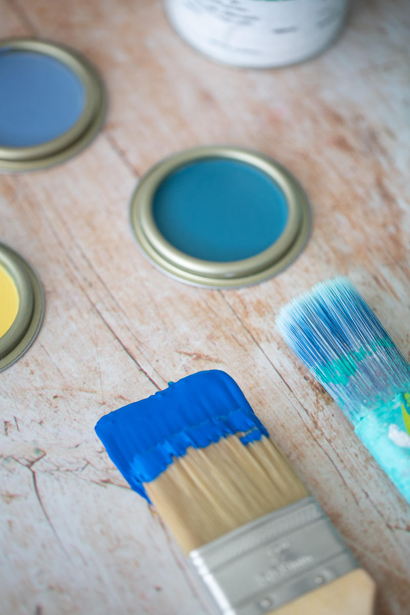
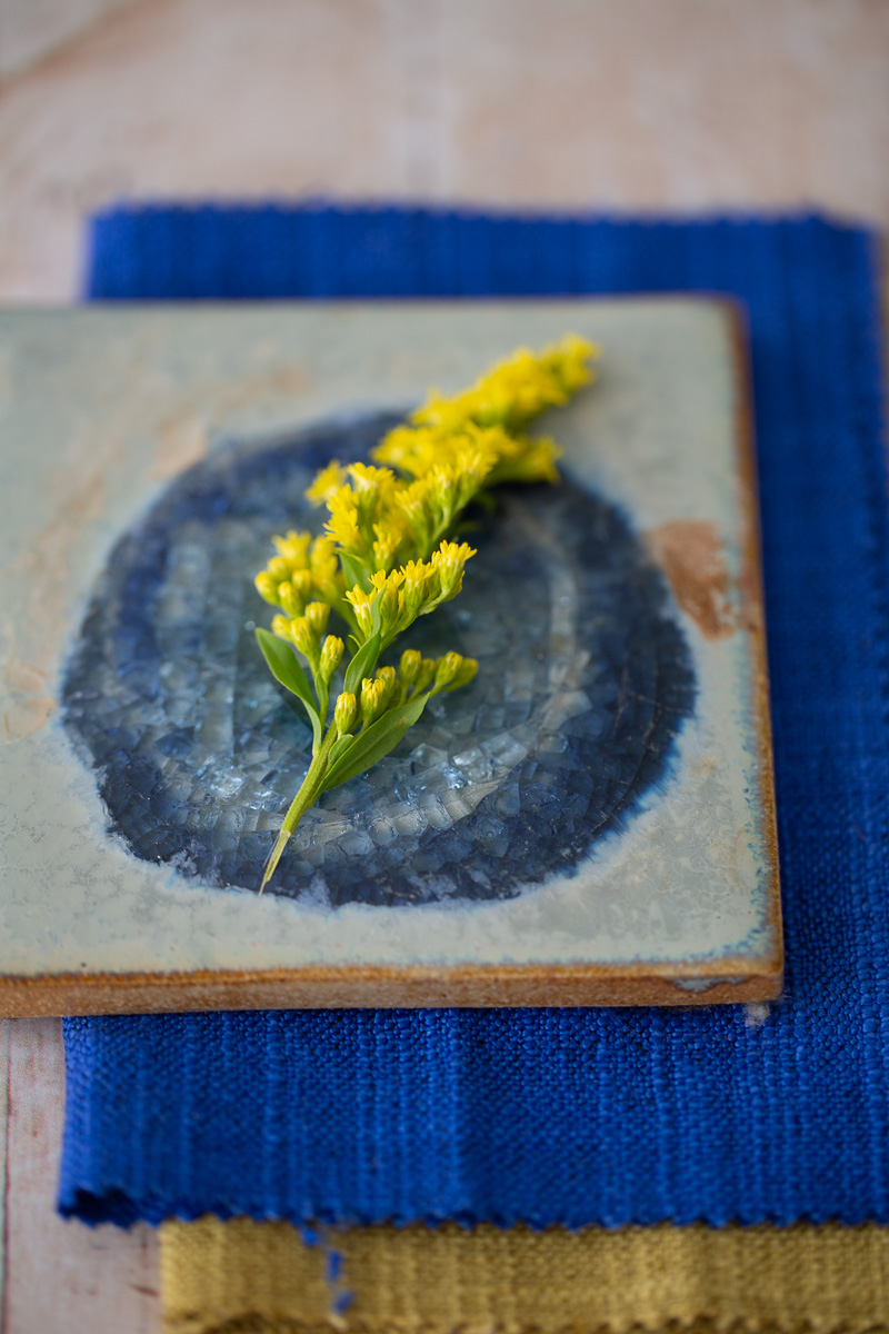
Blue pairs well with crisp white, for a Wedgewood-inspired classic feel, rich mustard yellows for a playful summer vibe or even blue-on-blue for a nautical freshness. Here, you can see the powerful Norwegian Blue, Blue Black, Rich Aqua, Petronilla contrasting with the vibrant Mustard Pot.
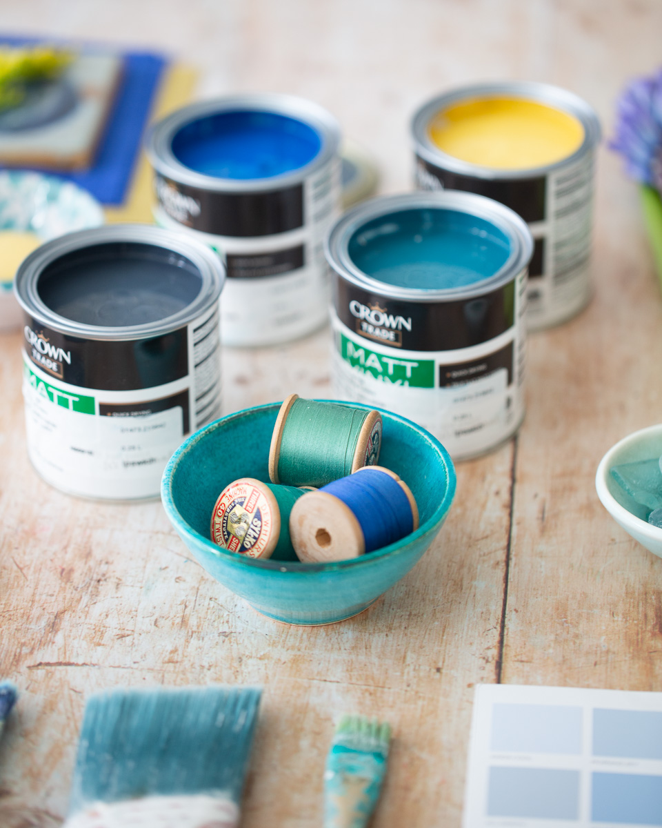
“We’ve also seen that blue continues to have its moment since ‘Classic Blue’ was crowned Colour of the Year. Expect to see lots of subtler shades that have taken their inspiration from nature”, says Elaine Verdon of Leo + CiCi, which really speaks to the calming yet strong Blue Black hue.
We hope you love using this collection as we loved making it. If you do, please tag both @houseandhomemagazine and @crownpaintsireland on Instagram and use hashtags #moodboardsIRL and #togetherwearebrilliant. We can't wait to see how you use our blues!
Crown Moodboards collection is available nationwide.
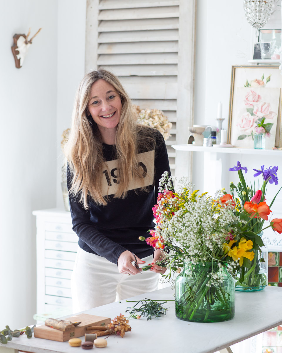
Styling by Ciara Elliott
Photography by Tamsyn Morgans
Videography by Poppy Bertram


