A House and Home promotion

Choosing colours for your home is no small task, but there is plenty of inspiration to be taken from your house's surroundings that will help your decor fit in with your environment seamlessly. With that in mind, we chatted to interior design Natasha Rocca Devine from The Interiors NRD, to get her advice on getting it right.
What are your top tips for how people should approach choosing colours for their home?
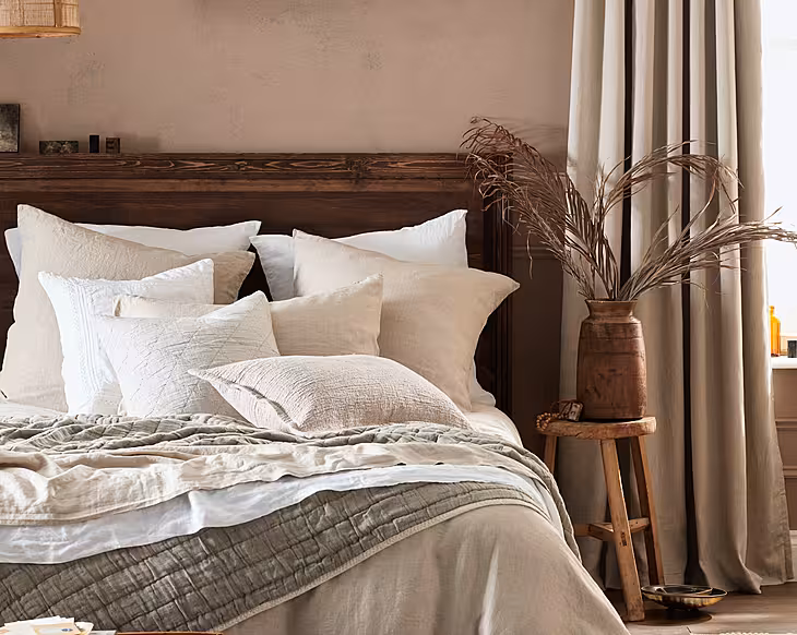
For all interior design themes, start by creating an overall mood board. Pick one or various inspirational images and create a colour scheme mood board from the colours featured in these. Choose two or three core colours and then complementary, contrasting, or neutral colours, and work from there.
Research paint brands online and create your personalised colour charts, budgets and quantities based on the size of your home. Once decided, buy sample pots from one or more brands, paint them in swatches on a specific wall, and give yourself time to see the colours at different times of the day.
Although there is a lot of planning, it will be worth it to enjoy your wonderful new colour scheme, which can transform your home.
How can you take inspiration from your surrounding area to inform your home decor style/colours used?
Take photographs of your local area at different times of day, of things you're drawn to and colours that appeal. With access to smartphones, everyone can be their own ‘inspiration’ photographer. You can create your colour mood board from the most predominant shades from your pictures.
Particularly when combining new colours to an existing theme or combining various strong colours, it is important to compliment and not compete with colours. You must find what suits you, the style of your home, your budget and overall theme. For all design, balance of these requirements are key!
How do you ensure that this 'theme' or colourscope can work throughout your whole house?
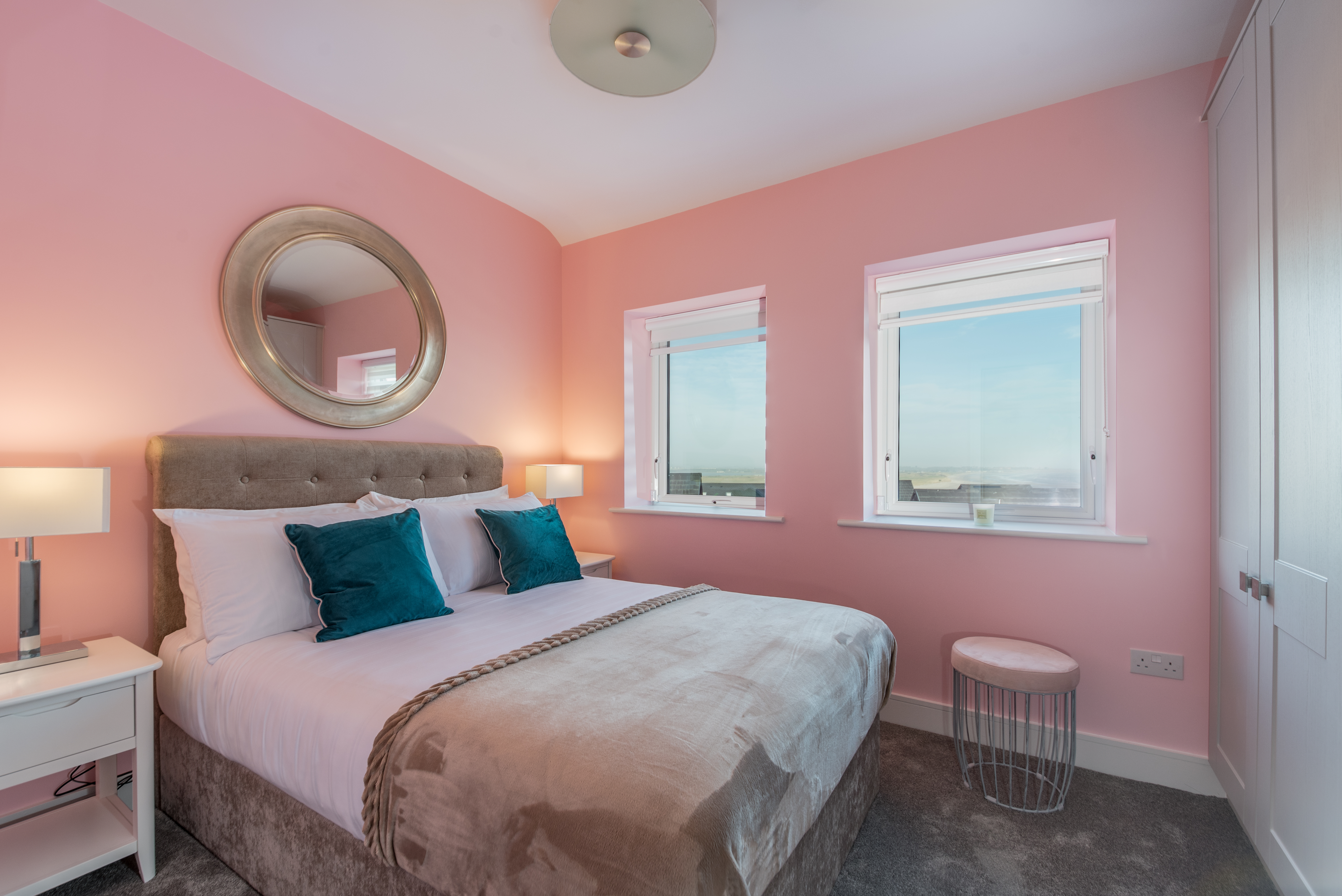
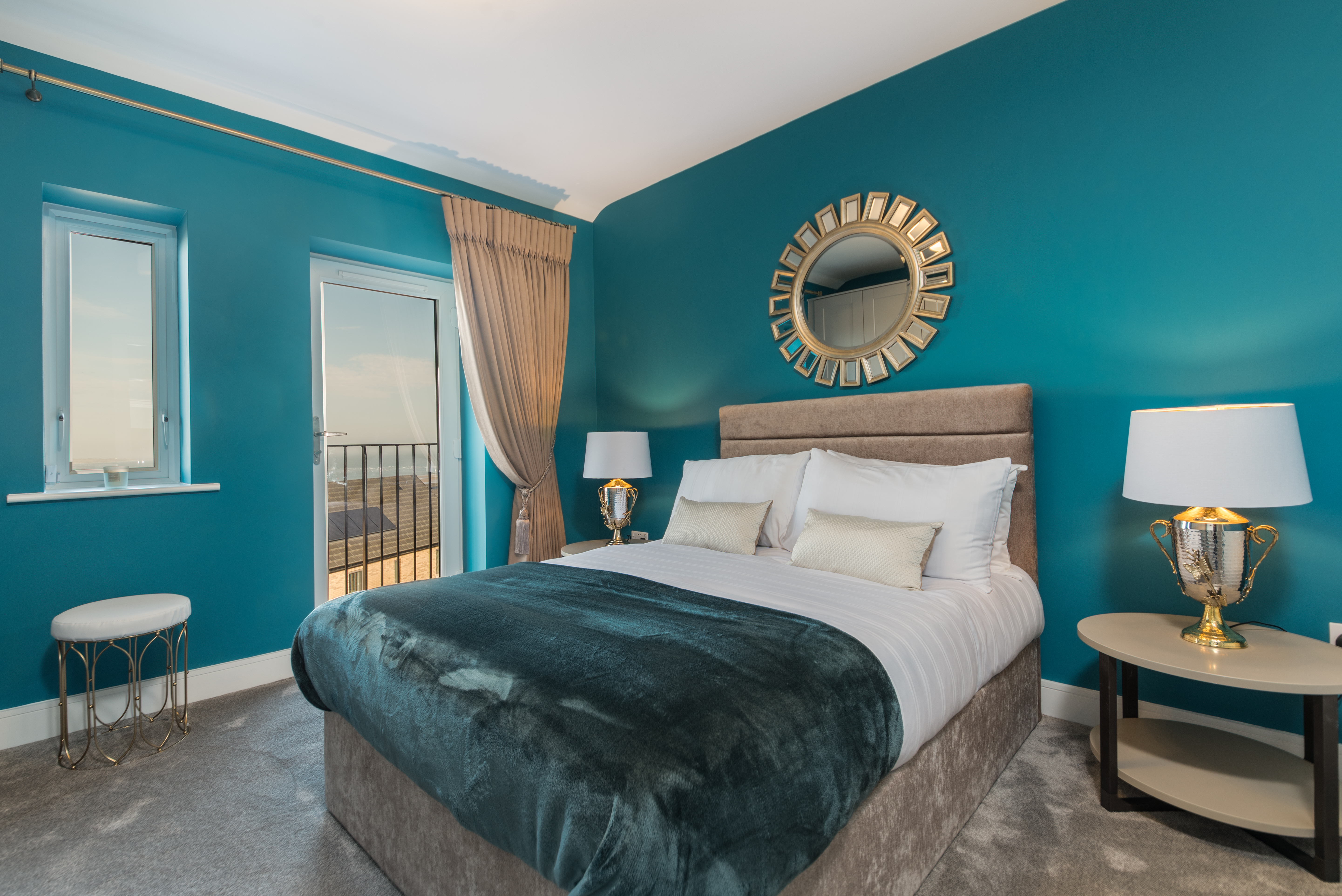
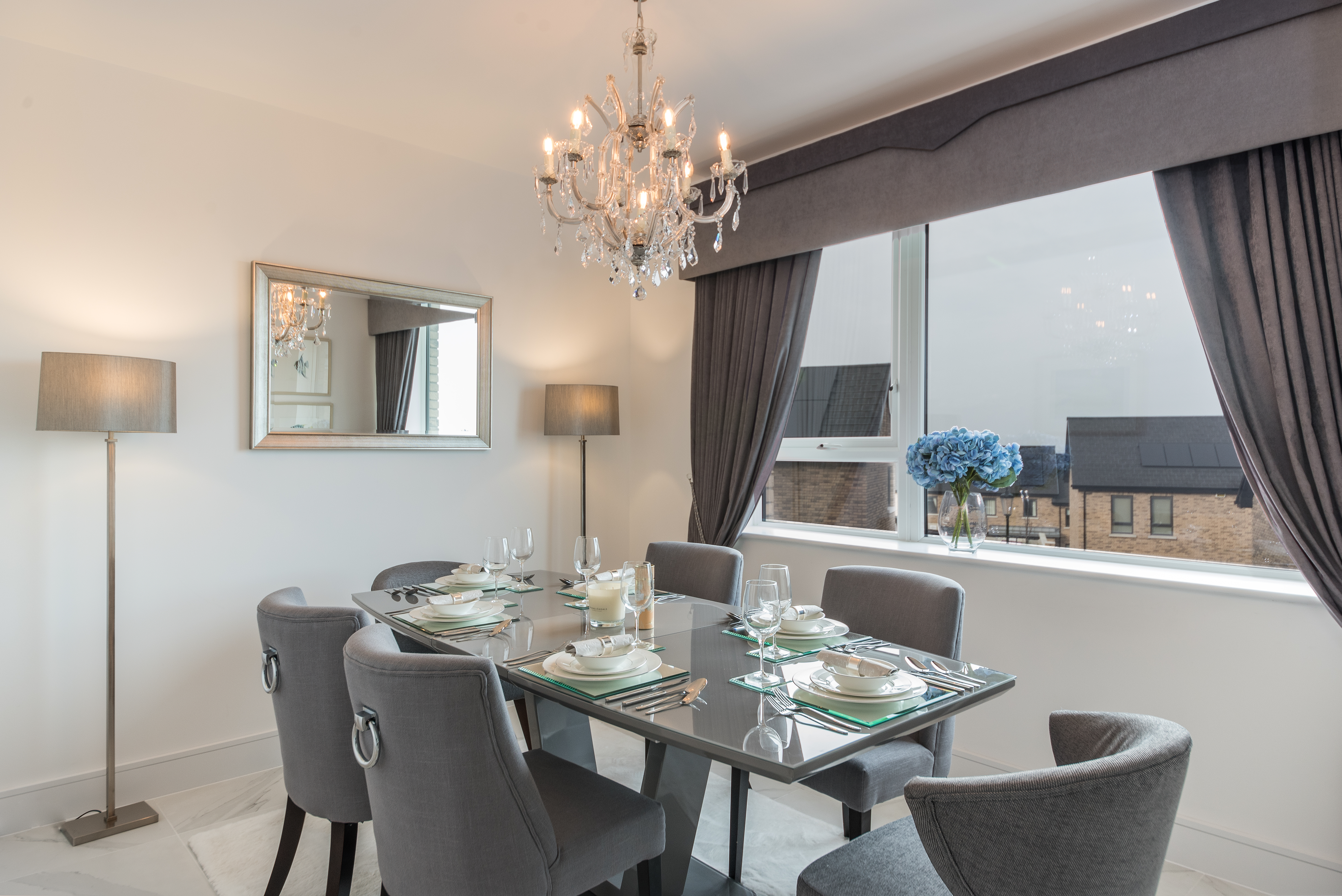
For Robswall by Hollybrook, a project I worked on recently, I was fascinated by the skyline at different times of day, particularly in the winter time. I used photographs of the skylines, which had peach/pink hues, blue, turquoise to create my 'Oceanic Luxury' theme.
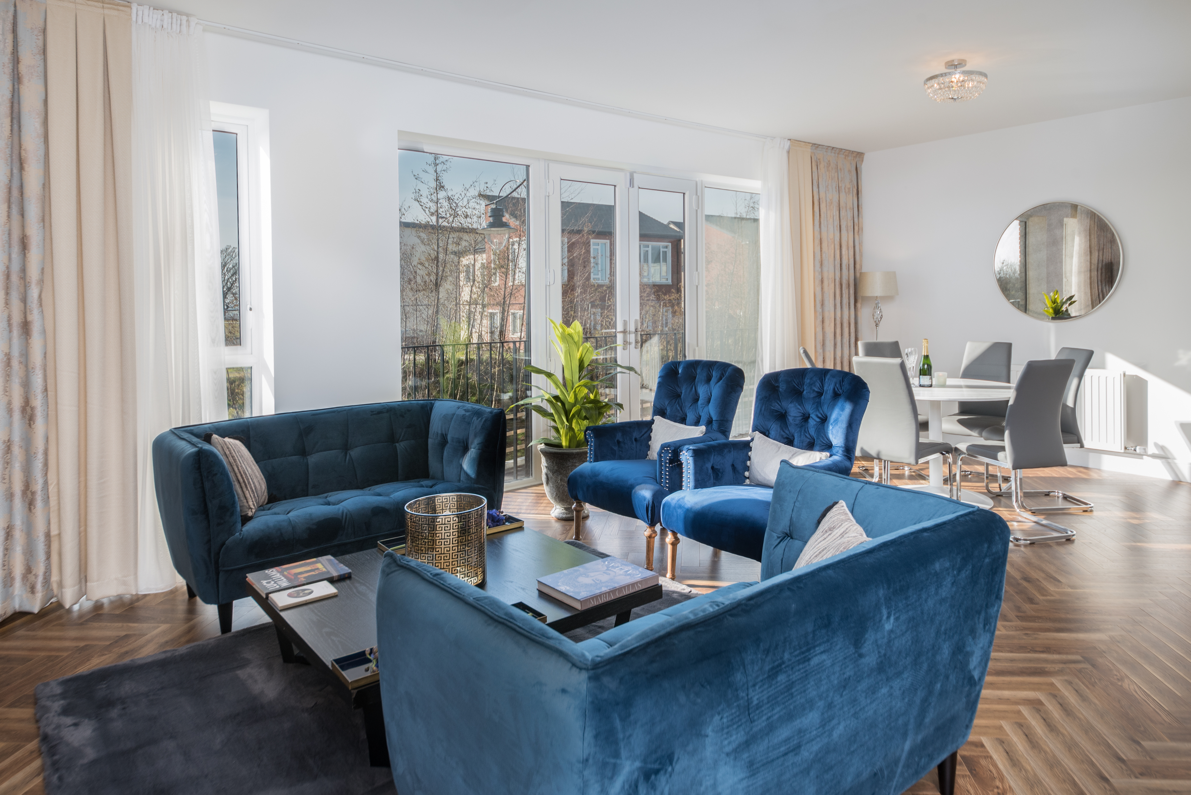
I collaborated with Curatorpaints, the new luxury brand by Colourtrend paints, which are steeped in Irish culture, and took a risk with bold colours for the bedrooms. In showhomes, interior designers opt for white and grey these days which has its place but I think a showhome should be bespoke to the style, the local area and the client.
It was a brave choice for me to use bright colours but I balanced these colours throughout with classic furniture, curtains, lighting and complimentary art.
How can your furniture and decor choices cleverly work with your colour choices?
For colours, furniture and soft furnishings are an ideal way to either compliment, contrast or complete your look. For Robswall by Hollybrook, it is based on the sunset hues, but complimentary, contrasting and accent colours of silver, gold and others, were brought into the scheme via furniture, paint, accessories, lighting and art.
For more information about The Interiors NRD, visit her website.