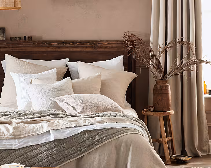
After too many years of polite neutrals and subdued palettes, the mood for bold is back. Adding colour to your home is one of the easiest ways to bring joy to your life. Author Emma Merry of Home Milk shows us five ways how
Words: Extracted from The Colourful Home by Home Milk | Photography: Neil Perry
First thing’s first. It’s not just about the colours you use in your house it’s about how you use them and in what proportions. For example, red is a strong colour, but it will be perceived very differently if you are using it in small amounts as an accent colour, than it will if you are using it on walls and ceiling in a fully colour-drenched room. The following ideas are just a few creative approaches to colour to consider...
1. Go one colour
A monochrome colour scheme revolves around the use of a single colour or variations of a single hue, and can create a beautifully harmonious and modern look. This design approach often results in a sleek, sophisticated and minimalist aesthetic where the focus is on the interplay of textures, materials and lighting to add visual interest to the limited palette. Some people can panic at the thought of going so ‘big’ with one colour and using it for everything, but I believe it actually adds an incredible air of calm and simplicity.
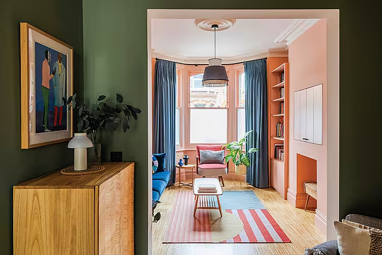
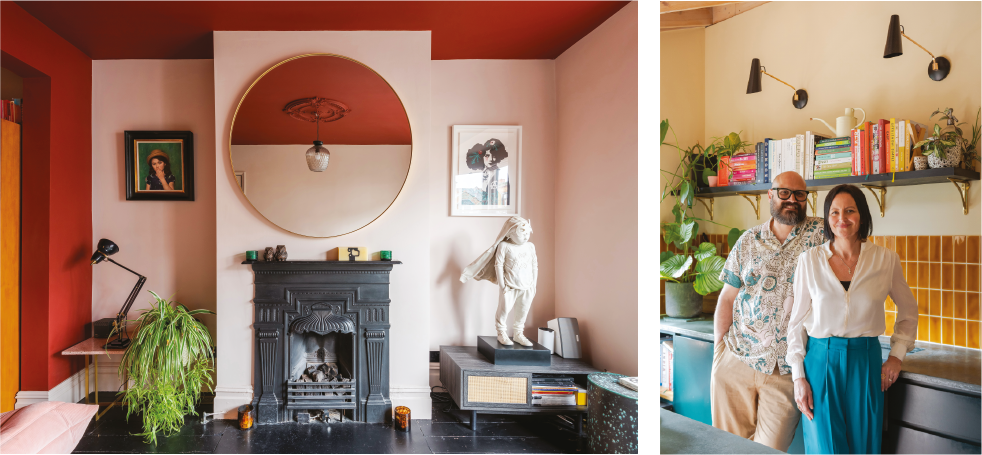
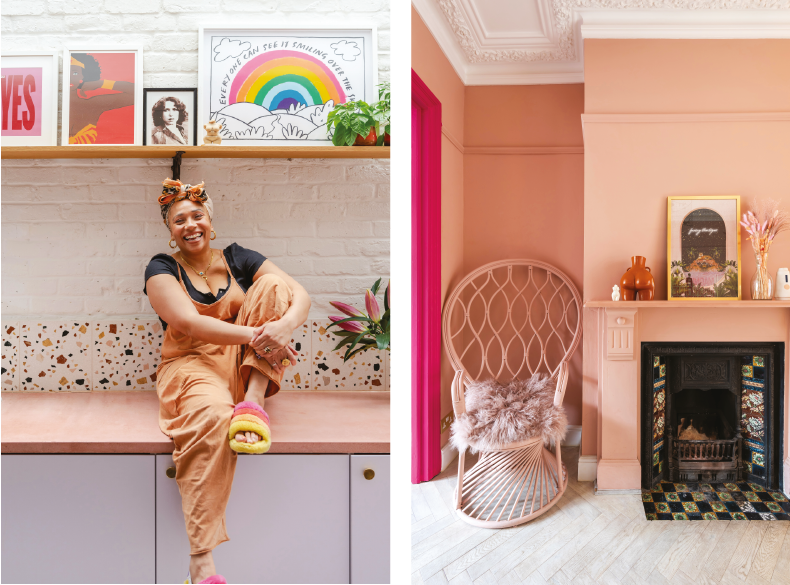
Above: Layers of colour and texture creates a characterful home for Emma and Simon. The living room is anchored by black painted floorboards while in the kitchen ochre coloured tiles bring in an earthy feel; Featured image (top): This north-facing lounge, in the home of Anna and Denis Wray, has been brightened with peach walls, which help maximise the light in their Victorian house.
2. Bring in flashes of brights
Adding a colour to an unexpected element of your space – such as the recess of a window or painting a fireplace or cupboard – immediately adds character. There’s something about a colour pop that says ‘I have a sense of humour’ without it veering too far into the realms of whacky. It is a simple first step for those who want to experiment with bolder colour in a smaller way before committing to full walls or schemes.
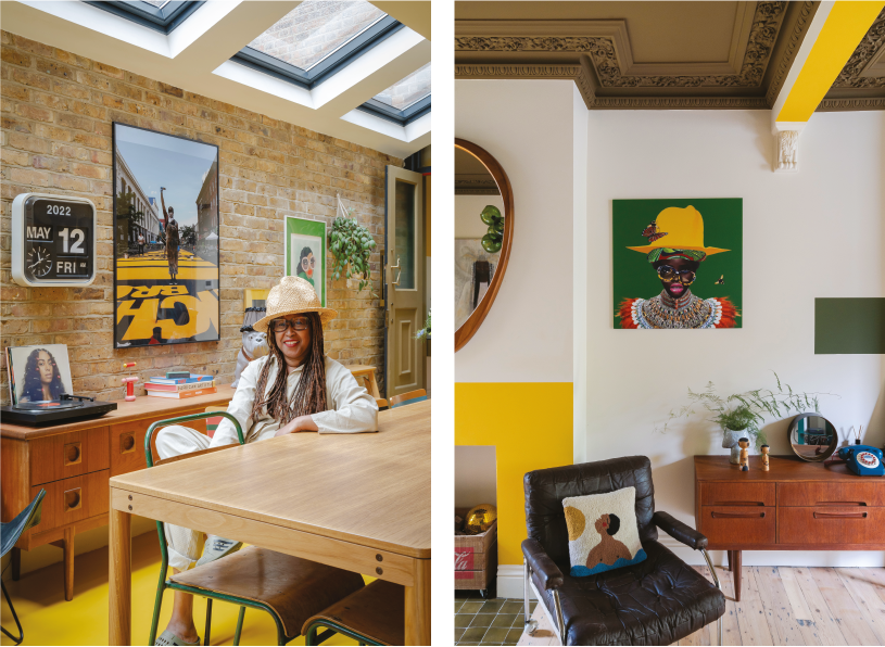
Above: Pops of sunshine yellow elevate the vintage-inspired interior of diversity consultant Natasha’s home; Below: In Rob’s home, primary colour beautifully spills from the banisters onto the floorboards.
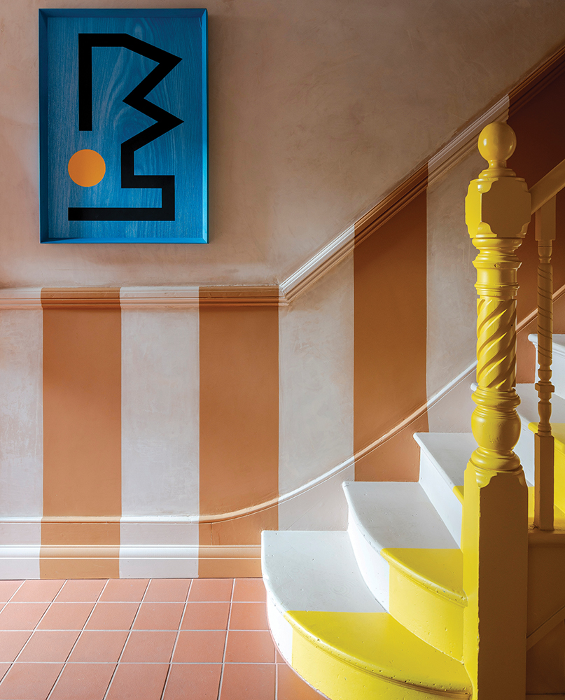
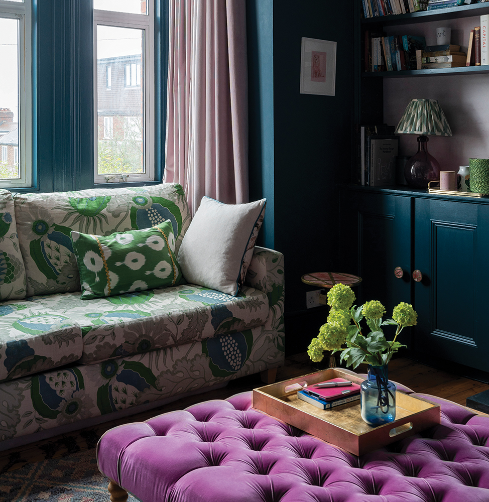
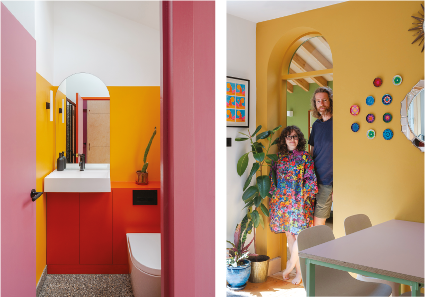
3. Give colour blocking a go
‘Colour blocking’ is the decorating technique of using large, distinct blocks of colour to create visually striking areas or elements within a space. It involves selecting complementary colours and applying them in solid, clearly definite sections for maximum contrast. It is a fun way to add a sense of drama and can be used to blur a room’s fixed edges and play with focal points and scale. It can also be used to delineate zones within a space.
Above: Soft, warm tones alternate with intense, deep colours to create different moods in Natalie’s home; Below: Deep blue walls create a cosy atmosphere in Emily and Ewan’s home. The selective use of pattern is effective set against the bold expanse of colour.
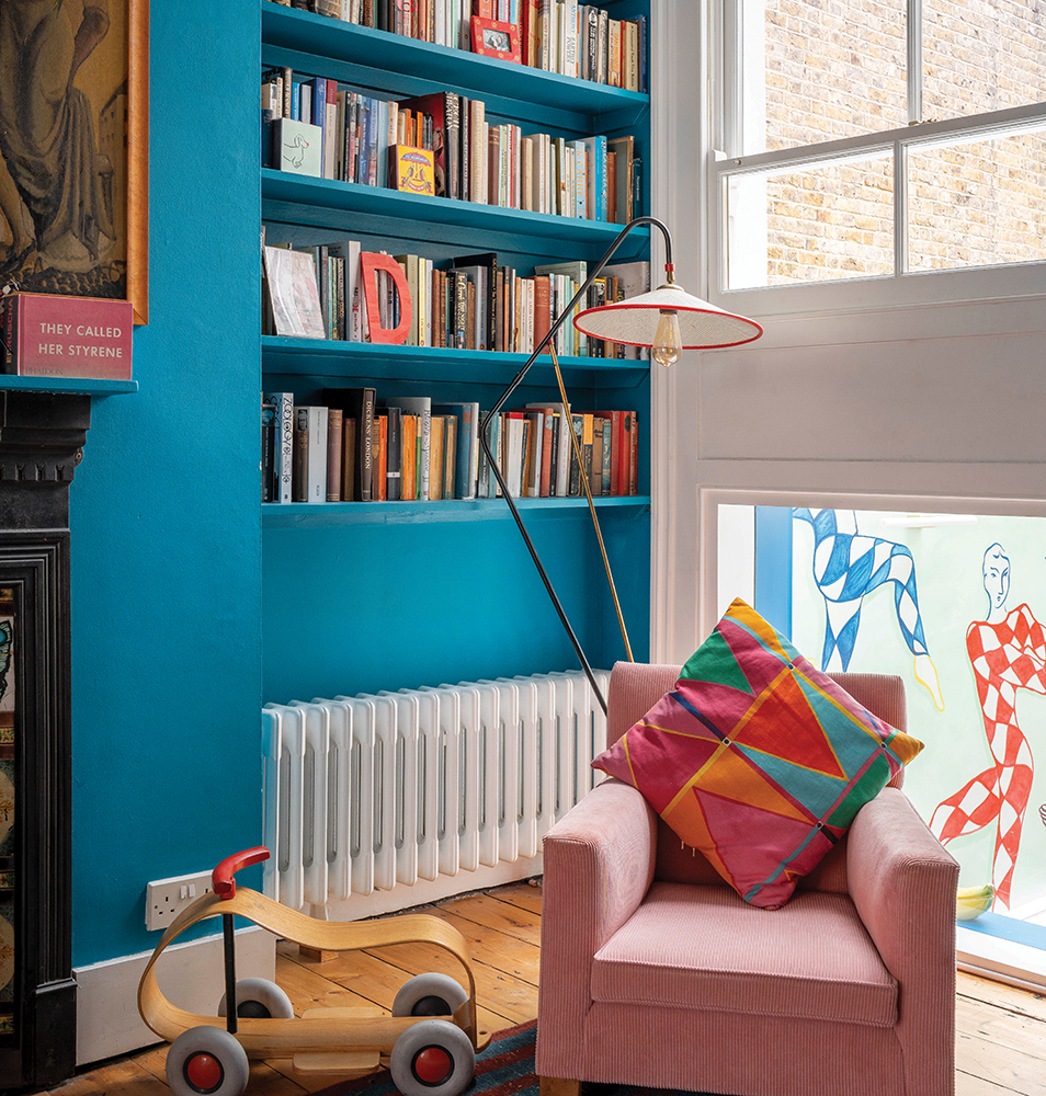
4. Don’t forget the woodwork
Often overlooked until the final stages, woodwork can play a vital role in your colour decisions. Have a look around your room; what opportunities do you have? Is there skirting, cornicing, shelving and picture rails? If you’d rather not draw attention to them then go for all-over colour drenching using the same paint colour as on your walls. However, if you’d like to make a feature of the woodwork – perhaps you have some fancy design features that you want to showcase – then try going for a contrasting colour. Features can also be emphasised by dialling up the contrast between wall colour and woodwork. Now, should you go lighter or darker? Lighter woodwork will create a sense of openness and airiness and darker tones produce a more dramatic look.
Above: In the home of Edwina Gieve, co-founder of sustainable maternity clothing brand Clary & Peg, book-filled shelves are in the same blue as the walls.
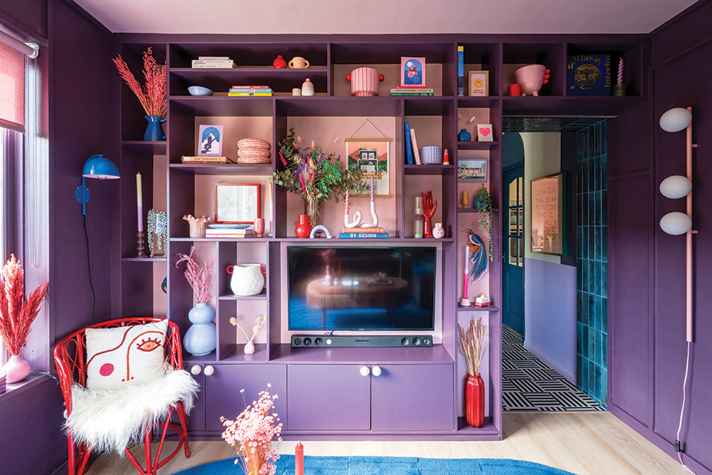
5. And paint the ceilings too
Yes, it’s the ‘fifth wall’ and I know, no one wants to get on a ladder with a paint brush for some back-bending work (and it is best done on a pre-hair-wash day), but how you approach the ceiling can make all the difference to your room. Whether you go for light and uplifting or deeper and cocooning will depend on the overall feeling you want to create. Bringing the ceiling colour down the walls will also create the added illusion of extra height.
Above: Bold, juicy shades are juxtaposed to create unexpected vistas in Tamsin and Ben’s colour-loving home; Below: This mood-boosting scheme in the home of interior designer Barbara Ramani is unapologetically full of colour.
The New Colourful Home by Home Milk & Neil Perry, €30, is available from Hoxton Mini Press
Can't get enough of bright hues? Then pick up some more top tips with these seven ideas for adding colour and pattern to your home.