Colour Trends 2020
Looking for some interiors colour inspiration for lockdown and beyond? From new creamy based neutrals to earthy reds and so many shades of green we asked six trend experts on the home colours they see for 2020 and into the new decade
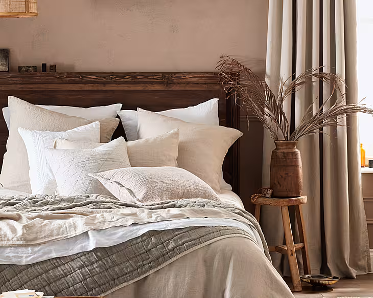
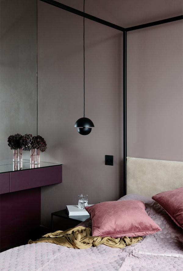
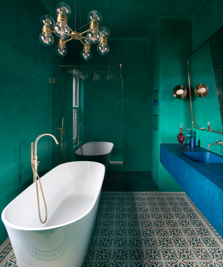 Rich and sumptuous shades of opulence in the master en suite of a recent Roisin Lafferty project.Shot by @barbaracorsicophotography
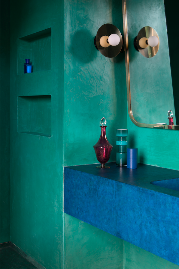
Roisin Lafferty
Founder and creative director at Kingston Lafferty Design
What effect might this pandemic have on people & their colour choices I think what the pandemic will do is encourage people to make their home a space they love. In a positive way, I think people will become more expressive and more willing to showcase their own personalities and wants. We have never been in a situation like this before. Now more than ever, we need to create environments that warm our hearts and make us happy, so I think people will be using a lot more colour than before.
What do you see as the upcoming trends in colour this year and next?
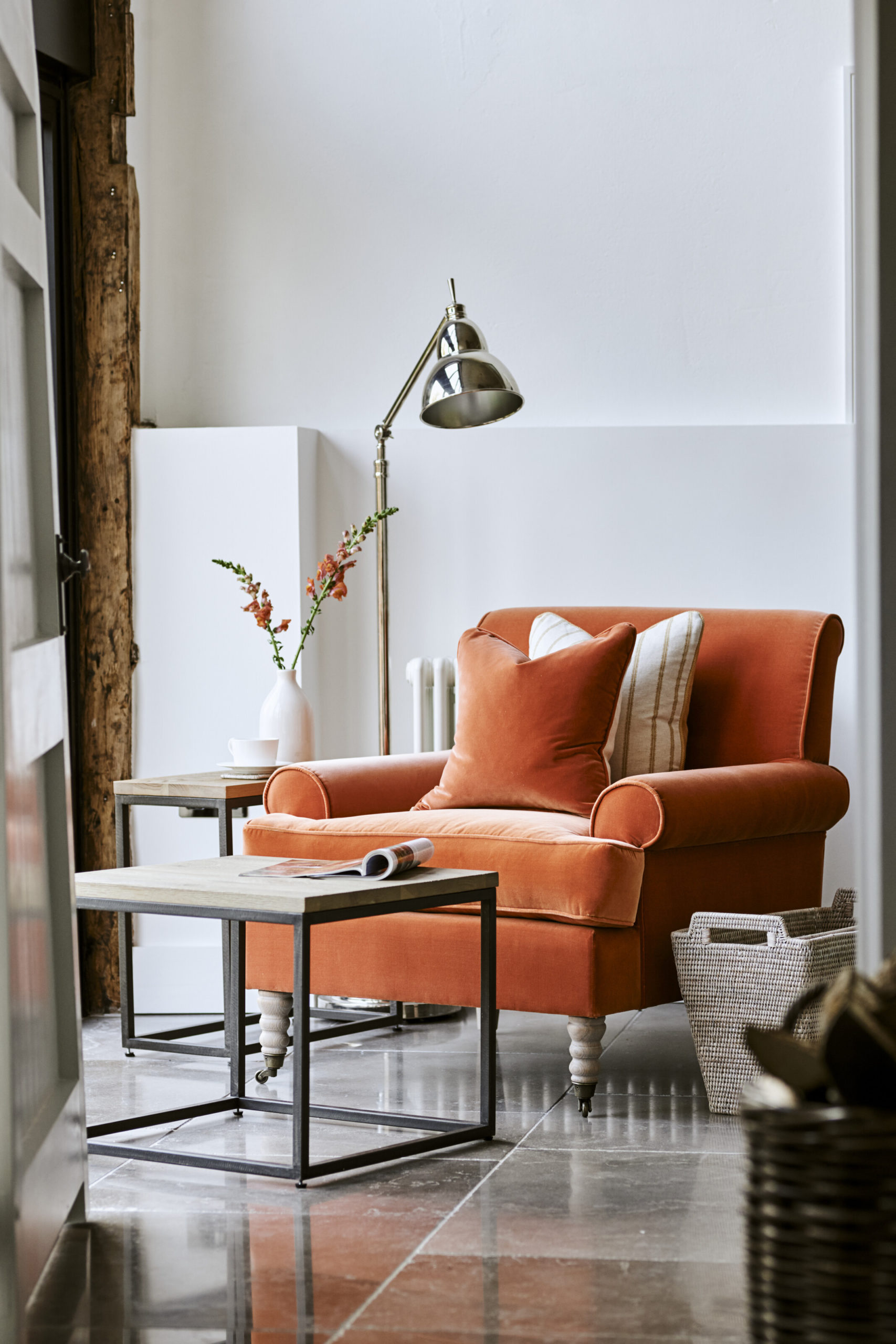
There is a focus on a natural, raw and organic aesthetic in a lot of international design currently. This includes a lot of polished plaster, plaster effect paint, terracotta and clay products and look for a warm and earthy look. This earthenware filters through to furniture and accessories as well as walls and ceilings. Paint is emulating these natural colour tones where the materials cannot be used.
Are we staying with a dusky palette or heading into fresher colours? The benefit of the dusky base is the timelessness of it. It is the anchor and base to more vibrant pops of colours. There is no reason that the dusky tones cannot work side by side with more punchy hues. The play on contrast can create something unique and unexpected. For me, the dusky base allows me to use stronger tones that could be garish otherwise. This is something I would encourage staying.
Do you see pastels coming through? Pastels have been gracing our commercial spaces for the past year. These have started to creep into our homes and will continue to. There is a certain playfulness in pastel hues, like candyfloss pink and mint green. Certainly, for children’s spaces, these are light-hearted and sweet colours. They can work beautifully in bathrooms too incorporating tiles and paint in different pastel tones.
Will grey still be the base colour or will the warmer colours such as honey and cream be coming through? Terracotta and mustard tones are certainly creeping in. Greys are still around but more so plaster-like grey tones. There is also still a love for the very dark charcoal greys too. They offer such versatility,
How about red and purple, which are colours we haven’t seen used in mainstream interior design for a while? Red is a colour I am beginning to see more of. I was venturing into maroons and burgundy hues but am definitely being drawn to primary red. The wonderful Pierre Yovanovitch has such a wonderful eye for colour combinations. He is very much in the limelight on Instagram and pinterest and I think his example will encourage people to take the leap.
 From a recent project by Roisin Lafferty. Shot by Barbara Corsico Photography
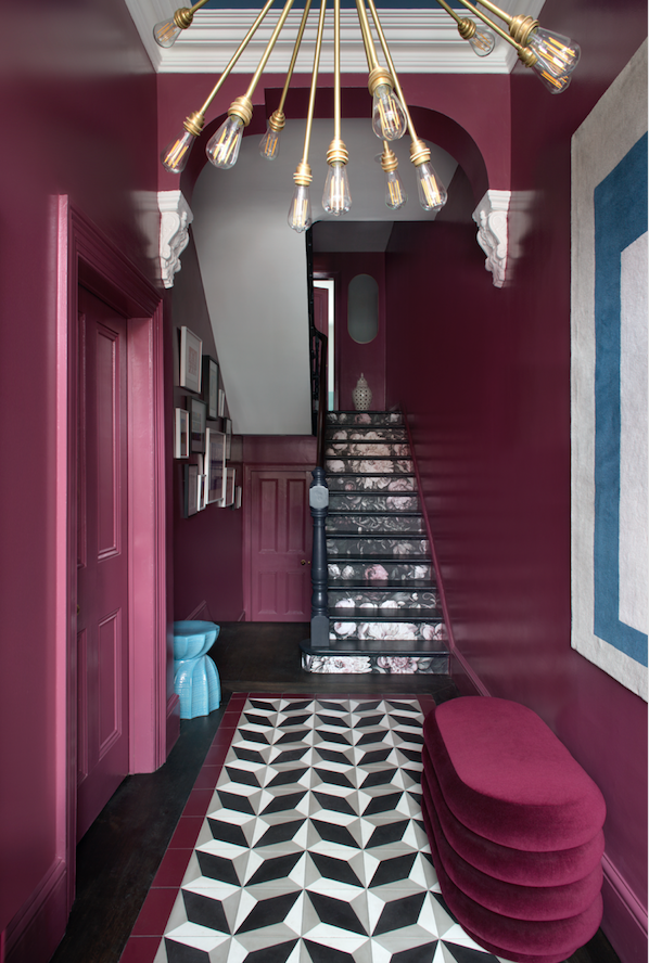
Interior designer Elaine Verdon at Leo and Cici
What do you see as the upcoming trends in colour this year and next? For so long we’ve been experiencing JOMO 'the joy of missing out', as we stay home, cocooned in our lovely homes, happy to let the outside world pass by. Now as sit marooned in our homes, attempting to navigate working from home, schooling and parenting , it’s very hard to predict how our tastes and behaviours will have changed.
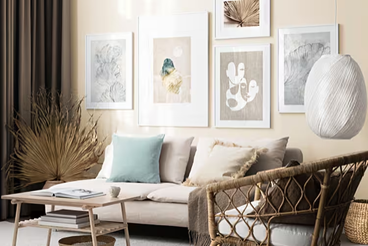
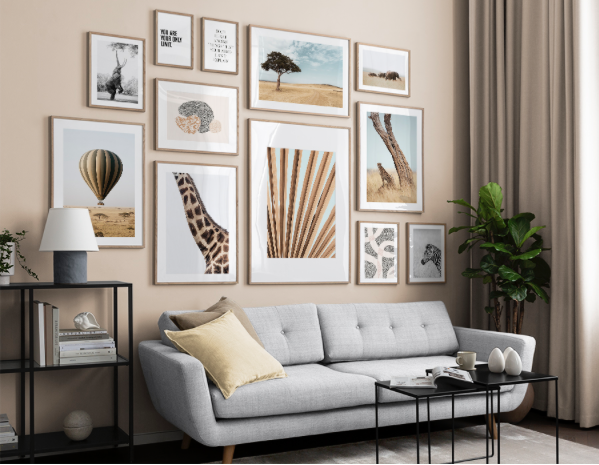 Gallery wall with images all from the new Desenio Wild and Free collection
If anything, over the coming year, the desire for calm and stability in such uncertain times, will remain prevalent. Choosing earthy, mineral tones and with nature-infused hues to instil that sense of tranquillity.
Are we staying with a dusky palette or heading into fresher colours? It’s a mix of both, it’s all about layering.
Do you see pastels coming through? Absolutely. You just need to look at Benjamin Moore’s colour of the year ‘First Light', and Dulux’s ‘Tranquil Dawn’, both are very soft but not too sweet and provide the perfect backdrop to layering in bolder colours within each palette.
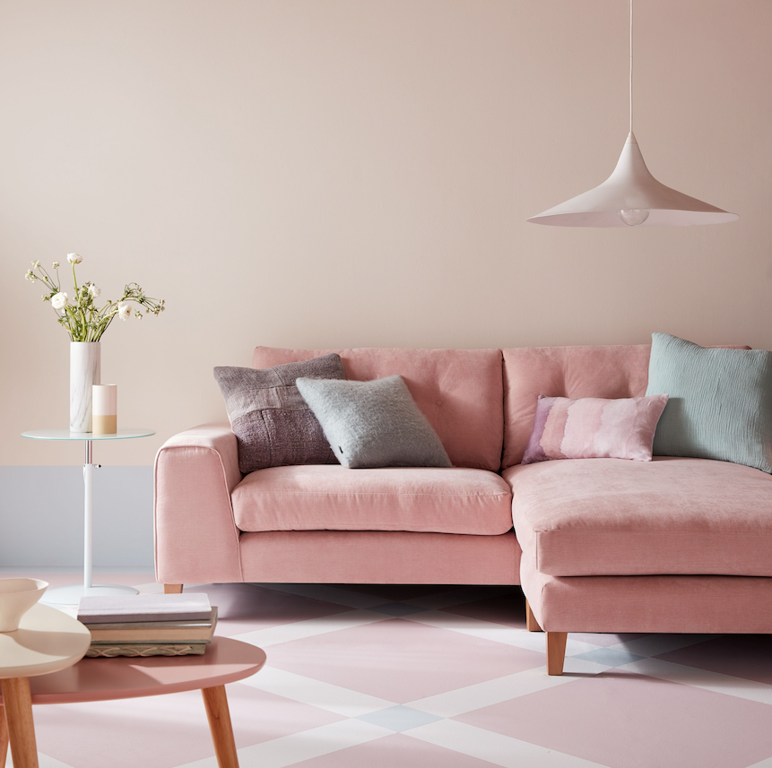 Image: Sofology. This is their 4 seater Demure chaise sofa in Blush
How about red and purple, which are colours we haven’t seen used in mainstream interior design for a while? Jewel tones and bold brights will continue to be prominent in response to minimalism and as we’ve seen on the recent catwalks of Milan, expect to see kiwi and lime shades along with more vibrant colours such as burnt orange, purple, green and red.
Will grey still be the base colour or will the warmer colours such as honey and cream be coming through? Base colours of neutrals will see elements of white with hints of warm caramels and lavender tones. We’ve also seen that blue continues to have its moment since ‘Classic Blue’ was crowned colour of the year. Expect to see lots of subtler shades that have taken their inspiration from nature.
Erica Davies, fashion and interiors influencer
What do you see as the upcoming trends in colour this year and next?
I really think we will all still be drawn to the sage green tones and corals that seem to have been bubbling under for a while. When you start spotting more of these colours filtering through on social media, it’s clear they’re a popular, feel good combination.
 Neptune's George chair is a pared-back, contemporary version of the traditional upholstery that might be found in a members’ club. See Neptune.ie
Are we staying with a dusky palette or heading into fresher colours?
I think we will want fresher, brighter colours that suggest optimism, positivity and health! Grey-greens and punchy shades of blue look modern and stylish, but also reflect nature - and I think that will be important to us all after what the world is currently experiencing.
Do you see pastels coming through?
Not pale pastels, but quite punchy, fun shades such as coral, or mauve rather than lilac. I think it’s all about instilling a sense of happiness and a cheerful mood.
Will grey still be the base colour or will the warmer colours such as honey and cream be coming through?
I think the creamy neutrals of honey and cream will really allow shades such as sage green and palace blue to sing as accent or feature shades.
How about red and purple, which are colours we haven’t seen used in mainstream interior design for a while?
I think deep red, almost vermillion, will play a role. Generally I think people are much braver with their choices for interior design now - and that’s certainly a bold one!
 Pic Carpetright
Any palette you are feeling drawn to now?
For me, my happy palette is always green and blue - of varying shades. We’re hoping to start redecorating again as soon as time allows - and the colours I am very drawn to are sage green and blue/grey tones.
 Image is from the Stargaze collection at Amara
Instagram interiors lifestyle influencer Reena Simon at Hygge for Home, hyggeforhome.com
What do you see as the upcoming trends in colour this year and next? At the start of 2020 I may have given you a different answer but given the crisis faced by the whole world right now I think we will see a shift towards colours that make us feel safe and calm within the confines of our four walls and I mean that in the literal sense which is something I never anticipated happening in our lifetime.
Are we staying with a dusky palette or heading into fresher colours? I think we will see a move towards fresh colours that breathe life into our spaces and are up lifting.
Do you see pastels coming through? Will grey still be the base colour or will the warmer colours such as honey and cream be coming through? We will see a shift towards a calmer colour palette and less of a draw to bold statement colours. Colours that evoke joy, happiness and tranquility. I think warmer shades of grey will be more appealing that have a yellow, red or brown undertone.
 Image from the new 'Explorer Collection' at Amara
How about red and purple? Red and purple can be strong and striking which often feels right for spaces that we don't spend a lot of time in, for example restaurants or places that want to make a statement. I understand and relate to these colours in a commercial setting more so than in a home but then again colour is subjective.
Artist, designer and influencer, Lucy Tiffney :
“If you had asked me a month ago I would have said that the colour trends for this year and next would be muted earth tones with warm rusts, peaches, dusky pinks and burnt ochres... but now because of pandemic I think people will be looking to a brighter/cleaner more mood enhancing, cheerful palette to lift there spirits - so think vermillion and cherry reds, hot pinks and oranges with sunny yellows. I think/hope the rainbow effect will impact in peoples homes now and in months to come.”
Kate Watson-Smyth, founder of the blog madaboutthehouse.com and author of Mad About The House 101 Interior Design Answers:
"At the start of the year there was a definite trend towards pale warm neutrals and while I think that will persist into 2021, I think it's possible that weeks of staring at the the same four walls during lockdown might encourage some of us to be braver in our colour choices. Over on our Facebook group for The Great Indoors Podcast we have seen lots of kitchens being painted strong, dark colours and and I am sensing a definite move towards strong, but still warm, shades that will make our homes feel cosy and safe. Green in all shades will continue to be popular from restful pale shades to cocooning dark versions, as well as warm browns - think bitter chocolate, cocoa and tobacco - and, of course, pink is going nowhere and is the perfect foil to those shades."