
Heard the news? Colour, print and pattern are back, and in Rebecca Brough’s 1920s fixer-upper home, she presents a masterclass in how to use them cohesively
Photographer and stylist Colin Poole/GAP Interiors | Words Annabelle Grundy
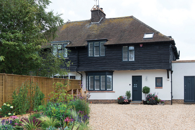
From the outside, you’d never guess that there’s a riot of colour, pattern and print beyond the hall door of Rebecca and Jonny Brough’s 1920s fixer-upper home, where they live with 15-year-old son Oscar. Located in Kent on the southeast coast of England, the house was a classic fixer-upper – but its raw potential plus lots of ingredients they wanted, such as a garden for Oscar and proximity to the beach, made it a winner.
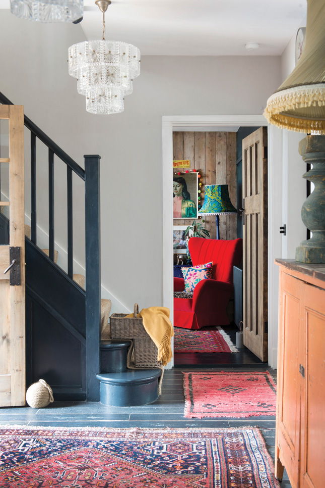 HALLWAY A painterly wallpaper mural from Surface View adds another level of depth and detail in the hall
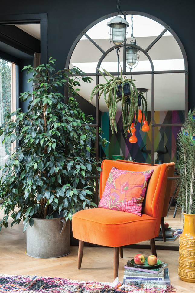
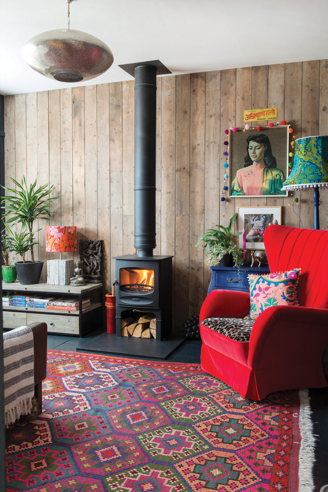 SNUG The Charlotte velvet armchair is from Sofa.com and the mix and match of textures allows Rebecca to build contrast with bold combinations.
So, despite its decades-old neglect, the couple ploughed ahead. “I realised there was scope to extend at the back and produce something interesting here,” Rebecca recalls, “I loved the idea of taking on a fixer-upper project, too.” One of the main things the couple – both psychologists – wanted to achieve was a sense of flow.
“I kept finding myself isolated in the kitchen while Jonny and Oscar were together in the sitting room,” Rebecca says. “That made me think hard about how our home should work. The idea of different functions within a single, integrated space really made sense.”
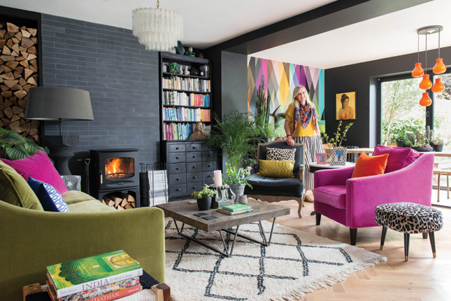
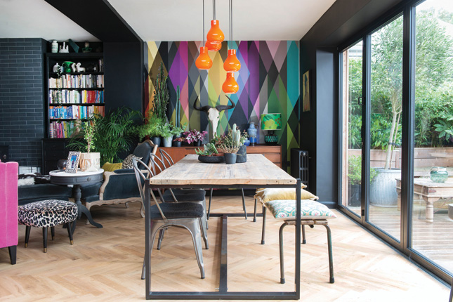
 LIVING AREA Farrow and Ball's Pitch Black is alleviated by a Cole and Son Circus wallpaper mural, and the vintage pendant lighting (look for similar on eBay) along with a plush velvet upholstery from Sofa.com in edible shades lifts this scheme.
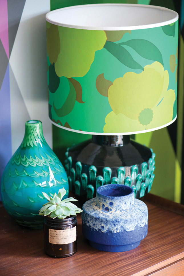
There were other reasons for going open plan, too. “Our love of cooking and entertaining drove the open-plan, multi-functional layout downstairs,” she says. “I thought carefully about how we’d use and live in the space as a family, and how we wanted friends to relax in our home. I imagined how we’d move around the room, and worked out the best places for everything in the kitchen.
“Whoever’s cooking is always included in the conversation, plates get cleared from the table to the island, and we can settle on the sofas around the fire after dinner. The space flows so well that we’ll often spend the whole evening in this one room.”
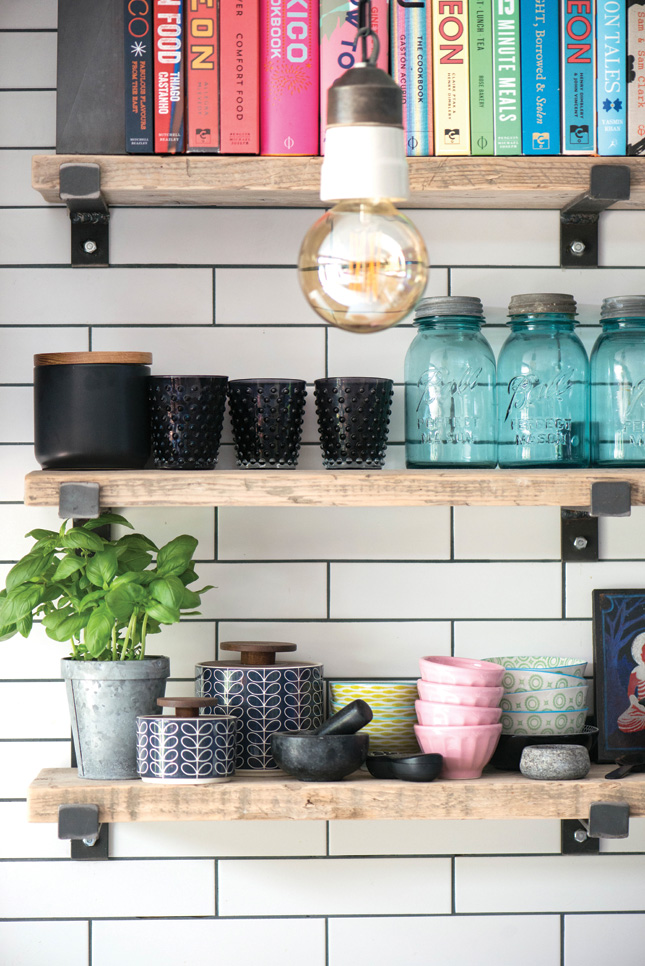
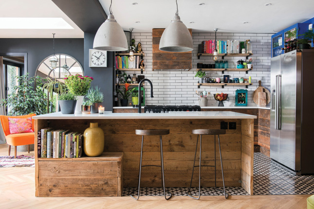 KITCHEN “I had in mind the idea of using recycled wood in the kitchen and when I spotted a pile of scaffolding planks at a reclamation yard I knew they would be perfect. A local joinery company helped me work out the measurements, design the island, and source smaller lengths of salvaged timber to build the wall-cabinets," says Rebecca.
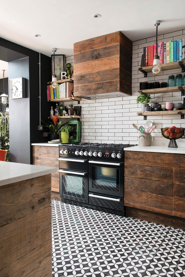
An architect drew up the design for a timber-clad, rear extension and helped Rebecca and Jonny secure planning permission as part of the fixer-upper project. From then on, despite never having project-managed any construction work before, Rebecca took the reins: “It was partly about saving money, but also because I have an absolute passion for interiors and design and I wanted to oversee and co-ordinate everything myself,” she says, “In hindsight I was pretty naïve, with no idea what a building project involves, or how ideas become actual structures.”
The entire venture took nearly three years, and Rebecca admits there were tough times, not to mention a steep learning curve. “I was juggling and organising constantly, the house was chaos and there were a lot of sleepless nights,” she recalls. “That said, I learned so much and I’m incredibly proud of what we achieved. We absolutely love this house and it is unique.”
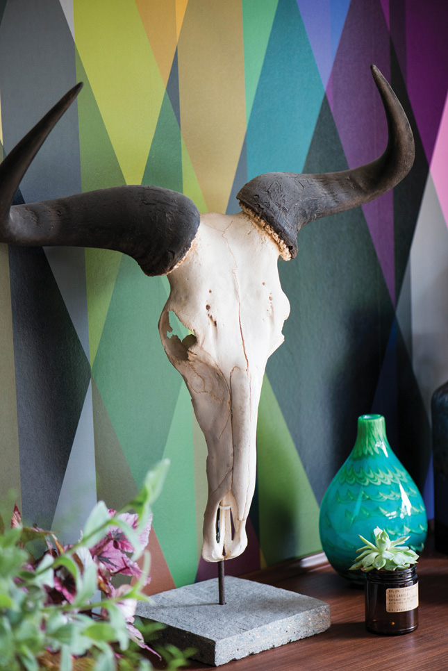
Now though, that’s all behind them. The traditional layout has been swept away, along with old-fashioned décor and 1960s plumbing. Instead there are vibrant colours and assorted patterns topped with an eclectic blend of furniture, lighting, art and accessories. At the heart of the fixer-upper house, a spacious, multi-functional living area fizzes with jewel tones, bold furniture pieces and stylish surfaces from velvet and glass to tiles and reclaimed timber.
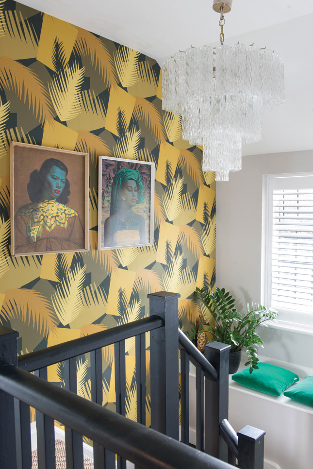 LANDING On the landing, Rebecca lifted an emerald green shade from an iconic Tretchikoff print and used it for the window seat cushions. The Cole and Son Deco Palm wallpaper, contrasts with the bannisters, painted in Farrow and Ball’s Railings. She found the vintage chandelier on eBay.
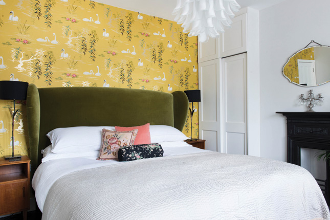 BEDROOM A black-painted floor and dainty, Nina Campbell Swan Lake wallpaper, bring an Oriental flavour to the main bedroom. Sunny yellows and rich, restful olive greens warm the pale grey backdrop.
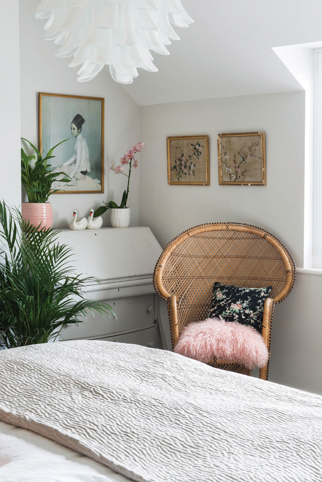
Rebecca’s affinity for colour and contrast shines, despite not everyone being on board with her choices. “The decorator thought I was mad when he saw the shades of black and blue I’d chosen for the walls,” she smiles. “I went for strong darks because I think they transform a bare space into a warm, comforting cocoon. The first time I saw the main living area, it looked so huge that I panicked, thinking it was going to feel stark and unwelcoming but the black walls make it homely and snug, especially in the evenings.”
 SPARE BEDROOM Budget-friendly finds like the second-hand chandelier, Indian throw and framed prints from a charity shop finds give the guest bedroom a laid-back, boho feel.
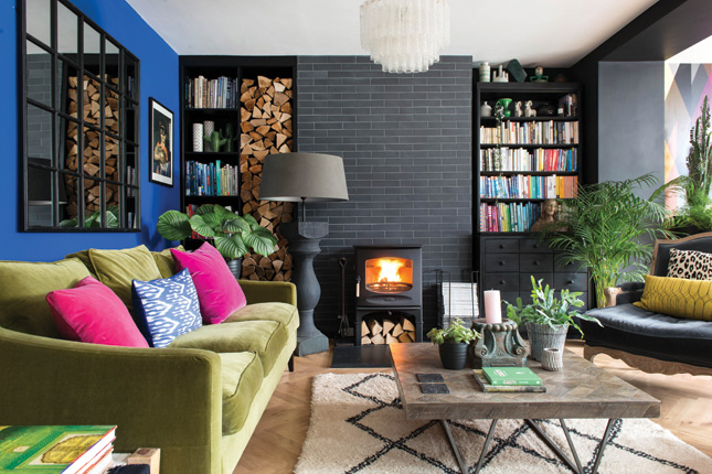
She’s added layers of visual interest throughout with her choice of accent colours and accessories to. “My taste covers vibrant blues, colour clashes, contemporary, vintage, mid-century and easy-going boho elements,” Rebecca explains. “With all my patterns and styles, I’ve looked for tones, textures and design details to create connections and produce a cohesive effect. For example, the wall-cladding in the snug reflects the reclaimed wooden kitchen furniture, and the black living room tiles and white kitchen tiles echo each other across the room. Sometimes, I’ll just have a cushion or lampshade that repeats a colour from a piece of art, and that’s enough to make the link.”
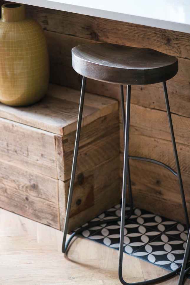
And living so close to the sea has had an environmental impact on Rebecca’s design too. “I’m really big on re-using and recycling. Alongside the green aspect, it’s a great way to bring unique character and history into your home.”


