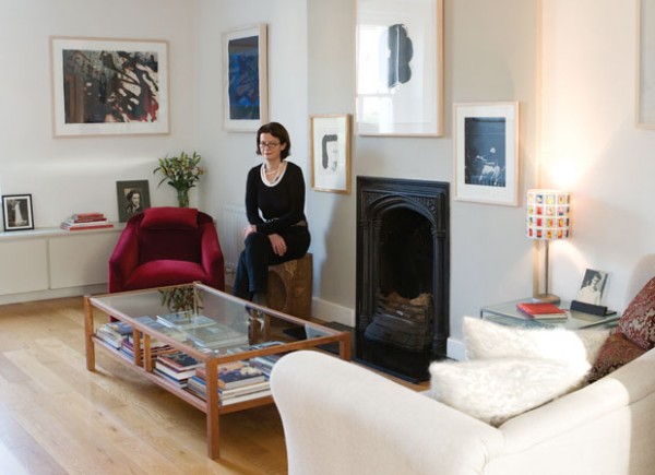
Interior designer Deirdre Danaher, welcomes us into her open plan living room, dining room and kitchen. The former two-bedroomed space is now one spacious area full of smart design touches and gorgeous finds.
Living area:
Deirdre customised the red velvet chair by taking the legs off to make it low. Now it’s nice and ‘squishy’ – perfect for watching television! The artwork on the chimney breast wall is all by Alice Maher, a personal favourite of Deirdre. The wall itself is painted in a slightly deeper shade of the soft grey used on the rest of the walls
When I bought the house there was a sixties tiled fireplace there and it was very unattractive. I bought an inset from an old gothic fireplace on Francis Street, so I used that and put a little timber frame around it. It’s painted black and it’s very minimal but it has nice work in it. - Says Deirdre

Deirdre's sofa is covered in a rough putty coloured linen. Deirdre had it made years ago, in about 1991, and had it re-covered is covered in lots of decorative cushions that she made herself. She likes the combination of the old velvet brocades and the rough linen. She believes that mixing textures is very important, nad thinks that it’s worth making lots of cushions when you find a really nice fabric
This Corbusier Basculant chair there is in ponyskin, with sling arms and a chrome frame. It’s a small chair, but dramatic in appearance. It’s an original, not a copy, as Deirdre firmly believes in buying originals for their enduring quality. She loves the texture of the ponyskin, particularly in contrast with the red velvet and grey flannel of her other chairs.
This Mart chair was designed by Antonio Citterio, it’s a swivel chair in grey flannel with dark red legs, and there are two Phelim Egan watercolours on the wall behind it. Deirdre painted a dark border behind them on the wall to define the art work, since the frames are off white and they’re not the right colour for the wall. It’s a nice feature and good for drawing attention to minimal art.
Kitchen and dining area:
I have two big pieces of art on the wall above my dining table, mono prints by Brian Kennedy. By putting art on a wall in a kitchen or dining area you really dress it up, taking away the kitchen feel and leaving out that clinical look. The kitchen is minimal, so you really need to get texture in to make sure that everything isn’t smooth and minimal. The chairs are Moller chairs, a Danish design from the 50s.
The table is by Enzo Mari, I chose it specifically because it has iron legs and works with the bench, even though it’s contemporary and minimal. The kitchen is a galley kitchen, it’s very minimal, I created a recess for it. It’s meant to disappear. The units go from the floor to the ceiling with no gaps, which is key if you have a small kitchen. It’s painted in off white with a limestone top. - says Deirdre
Tell us what you think:
Do you think open plan living areas are a good idea? Tell us in a comment!


