Painting your home - or even painting one room in your home - can be a big undertaking and there are plenty of ways you can go wrong when choosing paint. Hopefully you end up with the room of your dreams, but after investing time and cash into choosing the perfect paint colour, you don't want to be left with something you can't wait to paint over, so to help you prepare from the start.
we talked to three of our top paint suppliers to find out the big paint trends this year, and to get their top tips on painting your home and the big mistakes you should definitely avoid! Forewarned is forearmed!
Little Greene Paints and Wallpapers
What are the big colour trends you're seeing in interiors paints for this year?
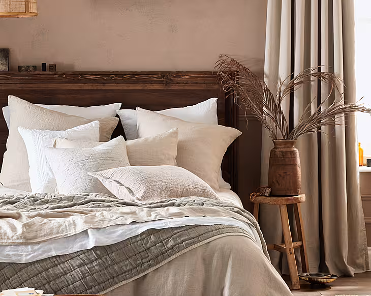
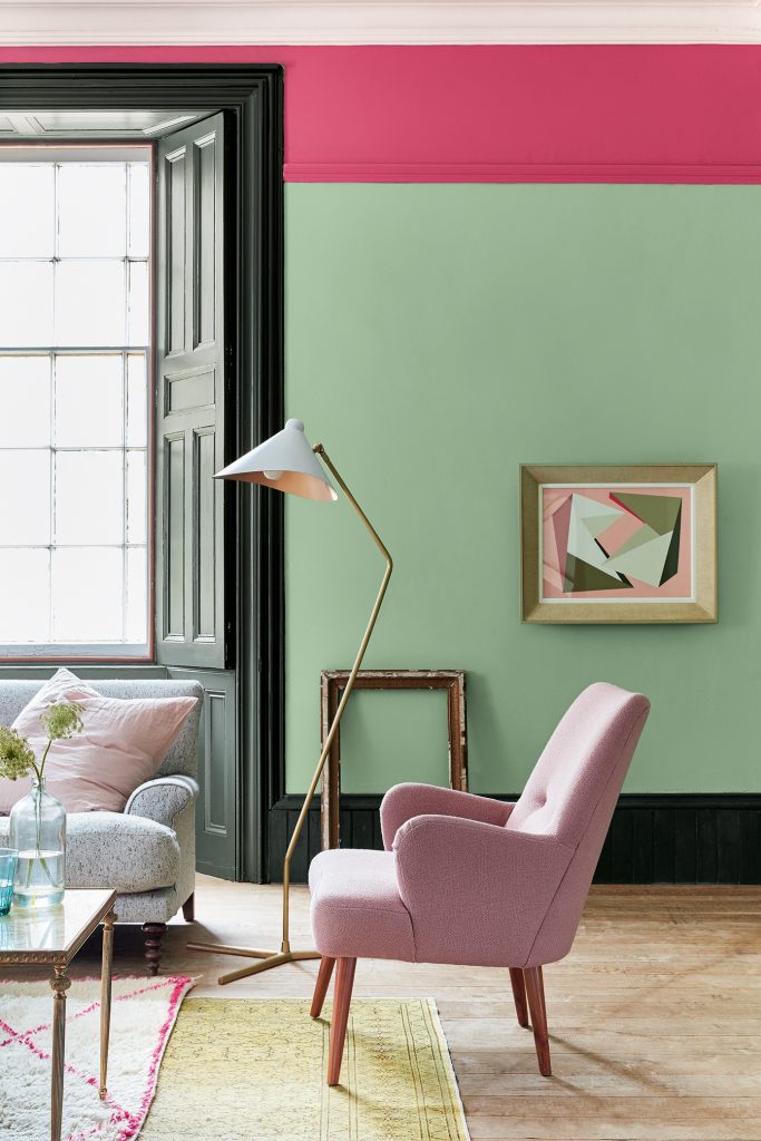
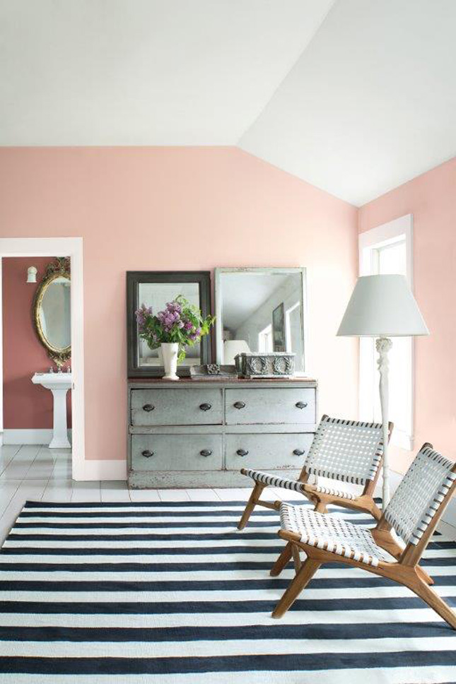
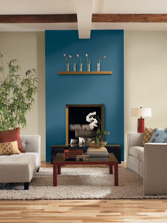
Dark blues and navy tones such as ‘Hicks’ Blue’ and ‘Dock Blue’ continue to be extremely popular as homeowners become more accustom and comfortable with the look. We also expect to see the resurgence of green used all over. Customers are certainly being much braver with their schemes! Our muted green tones such as ‘Livid’ & ‘Pleat’ which contain a touch of black in them are perfect examples of this trend. Green and pink combinations such as our ‘Pleat’ with ‘Dorchester Pink’ are also extremely popular at the moment.
Do you have any top tips for how people should choose the perfect paint?
We often recommend that customers start by choosing colours that they are naturally drawn to and build from there. Once you have studied our Colour Card and have an idea of what colours you want to use in your scheme, it’s really important to sample them at home, as colours can change throughout the day and subtly vary in North or South facing lights. Don’t forget the fifth wall! The ceiling is often forgotten about when painting a room. Where possible try to paint the ceiling the same colour as the wall to ensure that the eye isn’t drawn to the change in colour, which means the room will feel more spacious.
What are the biggest mistakes you see when people are starting redecorating/painting/choosing paint?
A common mistake made during the sampling phase occurs when customers only sample on one wall in the room and forget to sample the colour on every wall they wish to paint – once painted, each wall could appear slightly different dependant on the direction of both natural and artificial light.
For more information about Little Greene Paints and Wallpapers, visit their website or catch them on Facebook!
MRCB Paints and Papers
1. What are the big colour trends you're seeing in interiors paints for this year?
For 2018 we will see colour in homes again. No longer happy with tone on tone greys, colour is making a comeback. The launch of Caliente AF-290 a rich Red as colour of the year 2018 from Benjamin Moore and UltraViolet a vibrant purple from our Prestige Paint Pantone range. Both dramatic colours when used in isolation, but sparingly in the right combinations. You could make a dull room quirky by adding a pop of colour to Doors or Trim.
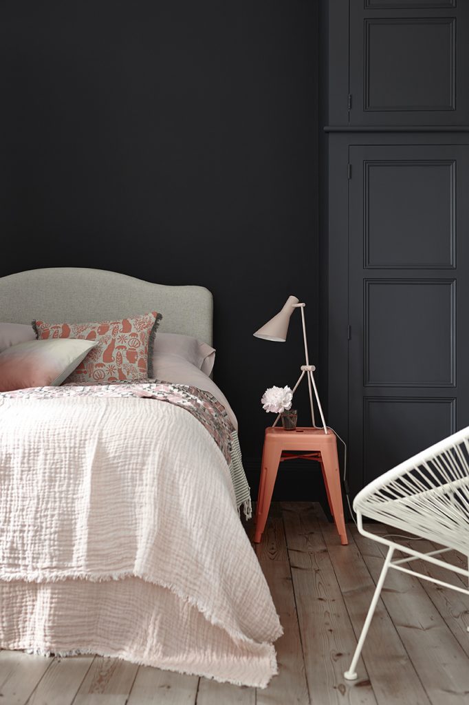
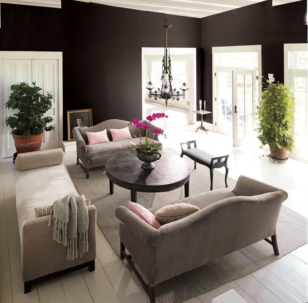
Grey is no longer a trend but now widely accepted as the new beige. However grey it is set to become darker, much darker, moving towards Black. We will see deeper interior wall colours in general, with dark browns and almost blacks used on all four walls. Dark Browns and Blacks are surprisingly warm when used with other soft muted tones. Red based greys or mink colours are perfect with blacks and won’t feel icy or cold. A popular grey Elephant’s Breath is a good example of a warm mink grey. A great Black to try if you have these mink shades in your interiors would be Black Beauty 2128-10 from Benjamin Moore.
On the other end of the spectrum if bold and dramatic is not your style, soft pinks are making a comeback. Originally a boys colour, a soft muted pink will become popular again. We are always looking for warmth, icy or bubble gum pinks will not fall into this category, rather the pinks of the past associated with Stucco work, soft and gentle pastels. Try out Colours like Soft Sand 2016-60 or |Pleasant |Pink 2094-60 from our 2018 Trends Chart from Benjamin Moore.
Icy whites will be less in vogue and dare we say it Beige looks set to be resurrected. Earthy and Sandy colours will feel less stark and rid Beige of it’s boring tendencies. They will also feel warmer when used with the new Blacks and other Deeper colours.
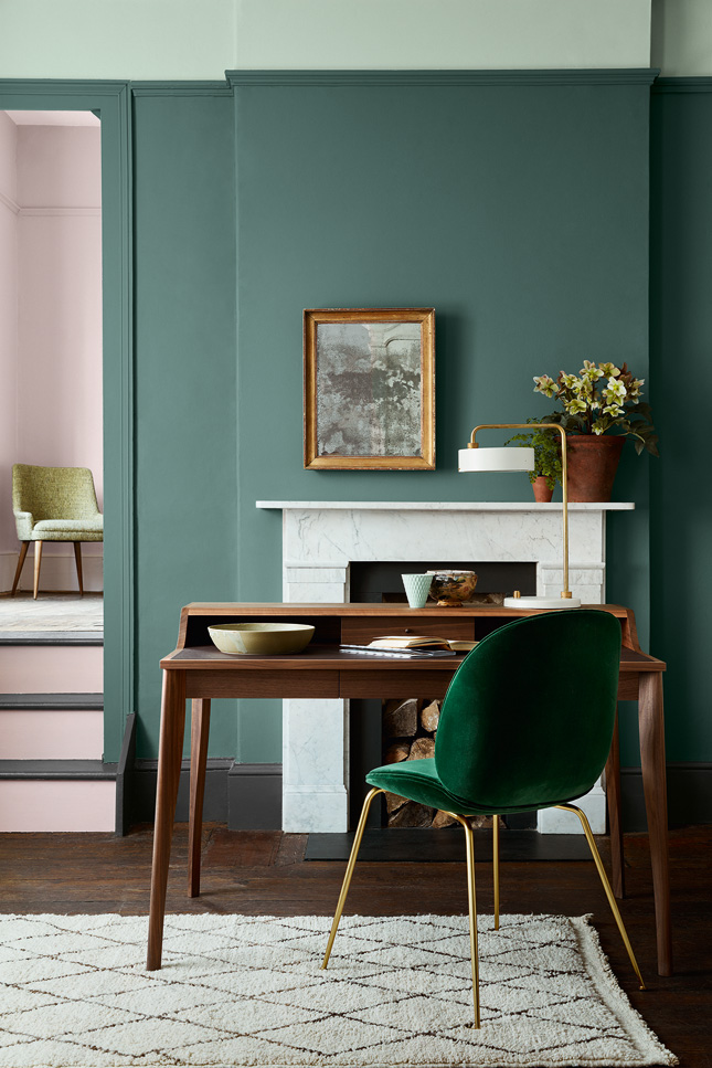
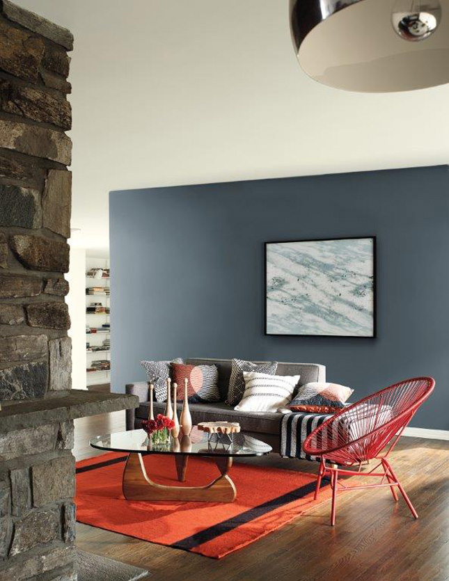
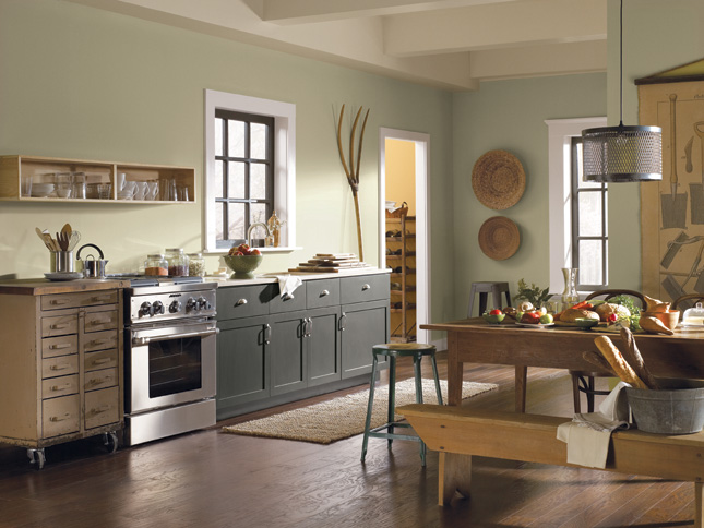
The proverbial ‘Forty Shades of Green’ will be everywhere. This time mixed with Blues, the deeper the better. The desire for tropical grasses in papers and fabrics will continue and can no longer be seen as just a Fad. We can’t seem to get enough of this look for Wallpapers, especially in small bathrooms, more about them later. Our greens and blues could be velvet sofas in Emerald with dark navy walls, this will be right on trend, in either paint or wallpaper. Jewel tones are what this trend is all about, with fabrics adding softness and deep blues and navy paint or Wallpaper completing the drama. We can’t seem to get enough of wallpapers, from large scale patterns to plain colours in natural textures. We are back to putting wallpaper all over our homes. There we go again, wanting to feel warmer. Wallpaper might become the new insulation for walls, when you can’t afford to renovate.
Bathrooms are where we like to and appear to be a little braver. One of the big trends for 2018 and onwards will be painting and papering ceilings, the 5th wall! We tend to have forgotten about ceilings but this is another area to introduce colour, or alter the proportions of a space. High ceilings can be perceived to be lower by painting the ceilings and walls in one colour. The smallest room in the house is perfect for trying this out. We guess you will keep going, when you realise how soothing it is wrapped in colour.
2. What are the biggest mistakes you see when people are starting redecorating/painting/choosing paint?
Not considering the rest of the furnishings in the space. Will you be changing the flooring, sofa, curtains, if so you should choose fabrics first, or at least consider what will work best with them. If you have a colour you must keep, (inherited furniture falls in to this category) work with it, rather than trying to obliterate it with a colour which has no relationship with anything else in the room. A dilemma many of our customers face is not being ready to buy a new sofa but the decorator is arriving first thing Monday morning. What might help would be trying a little window shopping and have an idea of what your plan is! Always ask the Store to give you a sample of fabric or borrow one for the day. This way you are sure your colour scheme will be harmonious.
Not testing the colours. We know buying Sample Test Pots can be off putting when you’re in the frame of mind for a spot of DIY at the weekend. Testing will save you money in the long run. Never make a decision on a colour seen only in your neighbour’s, a show house or a photo, without testing first. While each of these places are perfect for inspiration, remember you need to test paint choices in the area you are painting. We would go further and recommend, if you have enough time, to look at your paint samples for at least a week before you buy the paint. Just watch that paint dry then cure over time….you could love or hate what you see at different times of the day.
Not checking undertones. Not knowing what undertone your material or paint colours have. Take whites for example….yes there are more than one! If you place a number of whites beside each other you will see the different undertones in them. Some will appear greener, more yellow, blue etc., some will appear grey. Try to keep within the same tonal family and you won’t go wrong.
Using too many colours. Picking too many colours for your scheme can lead to a messy look and no one item becomes the focal point. The trick is to use no more than three colours until you become more experienced. If you consider using the ratio of 70:20:10 with 70% the overall walls and floors in your main colour with furnishings taking up 20% and 10% your pop of colour for accent. The remaining 10% will be made up of a splash of colour which you could change from season to season. This is a great way to ensure you don’t get bored or tired with your surroundings.
For more information about MRCB, visit their website or catch them on Facebook!
Albany Home Decor
 Celestial Blue
1. What are the big colour trends you're seeing in interiors paints for this year?
Grey has endured as the neutral colour of choice for a number of years as the dominant interiors backdrop, but rich pigment colour is showing signs of going bolder this year. People are feeling more confident with colour choices and are increasingly seeking an exciting contrast to grey. This is extending to walls, kitchen units and furniture, as well as soft furnishings. Some of the key colours to watch for the year(s) ahead are mossy greens and emerald, navy, violet, mustard and earthy shades of orange, terracotta and ochre. Even some soft pink shades are proving more popular which is probably a reflection of peoples colour confidence and the trends in fashion and interior design. The Pantone ‘Colour of the Year’ for 2018 is Ultra Voilet following from Rose Quartz, Serenity and Greenery in recent years.
The Irish pallet will reflect much of this wider colour movement but there will always be strong tendencies towards having some cream, fawn, beige and sand colours featuring in our choices and this is set to continue throughout the year ahead.
2. Do you have any top tips for how people should choose the perfect paint?
No. 1 - choose your preferred colour from a wide collection or range and a colour card that uses actual paint chip deposits instead of a screen printed colour card. This gives you an exact impression of the colour and how it projects in different lighting situations. It is best to follow this choice or selection using a small tester pot of A4 colour sample and place it on the subject wall to get the sense of the colour in the room. It will also be important to consider the wider interior scheme in the space when choosing you colour.
No.2 - What finish do you want? Flat or even chalky finish or a vibrant sheen finish are the two ends of the spectrum here. If it’s timber you’re painting e.g. skirting, doors or cupboards you may want an eggshell or satin finish or even a high gloss effect. On walls washable and scrubbable matt is an increasingly popular finish as it doesn’t reflect light with a sheen and it is easy to clean without fading.
No. 3 - Acrylic and water based paints have almost replaced oil based paints in recent years. There are also some hybrid formulations that perform better than the traditional satin and gloss paints. This means a major reduction in chemical ingredients and emissions as well as the odor from the paint. The other benefit is the drying and recoating time has significantly reduced without any reduction in the quality of the paint and its durability and performance.
No. 4 - Coverage is an indicator of both quality and value in the paints game. If the coverage per square meter/foot is higher than an alternative brand of paint it is well worth the consideration and a few euro extra. Paints that cover well not only cover more space per litre, but also reduce the number of coats needed which is a major factor when time is precious. Many brands of paint will sell lots of features and benefits but this is the most important factor between different paint brands.
3. What are the biggest mistakes you see when people are starting redecorating/painting/choosing paint?
Indecision is always a bad position to start from. The choice in colour, design and pattern in wallpapers and fabrics is vast and when blended with furniture and flooring it is really important to avoid too many competing moods, colours and styles going on. Getting to a decisive and simple pallet is a critical path for the project and one that will allow everything to fall into place.
Scheduling and sequencing of tasks is important especially if it’s a new build or a renovation and there are other works like electrics (chasing walls; sockets; etc) or flooring going on. Professional decorators and other tradesmen are experienced in how to schedule a works programme to make it efficient and smooth. Clients just need to have this conversation with their decorator at the beginning and if they are doing the work themselves they need to plan each task in a sequential order to avoid disasters!
Wallpapering is more complicated than painting and often requires a specialist and experienced wallpaper hanger to get the job right. Apart from a professional hanging and matching result there can sometimes be lines or even just optic illusions of lines in the seams. This can be more prevalent when the pattern is smaller and more repetitive in the paper. Mostly this issue is not critical and can be fixed but it can in rare cases create a lot of headache and extra cost.
For more information about Albany Home Decor, visit their website or catch them on Facebook!