
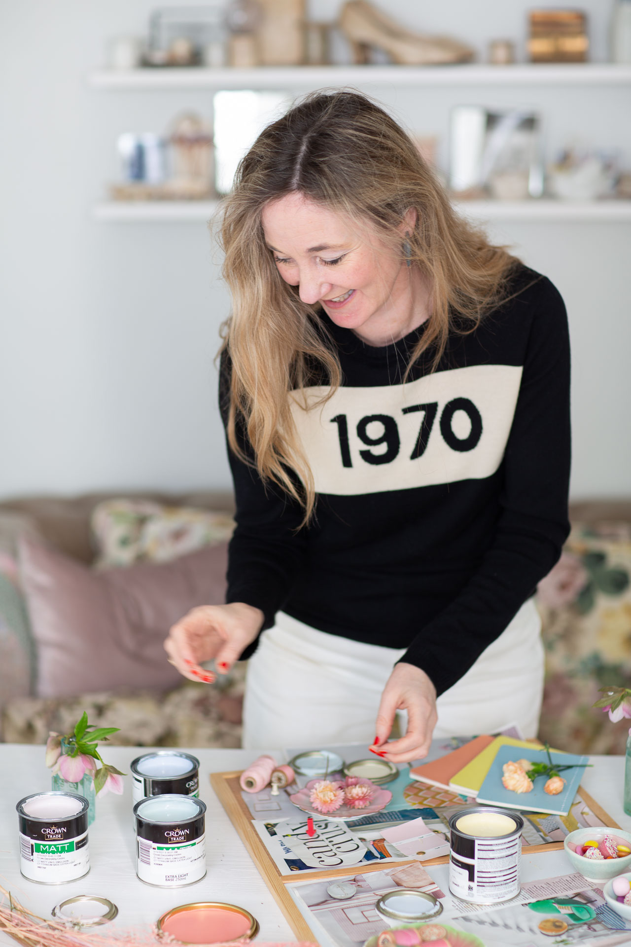
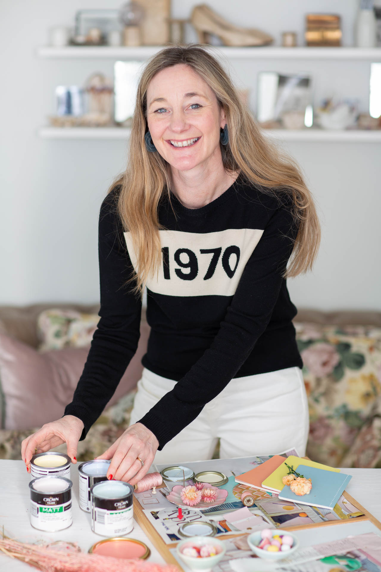
With things finally feeling a little brighter in the world, we figured it was the perfect time to introduce the next colour story in our Moodboards collection with Crown Paints. And we're excited to tell you a little more about why we knew we had to include these hues; and we know you'll love them as much as we do!
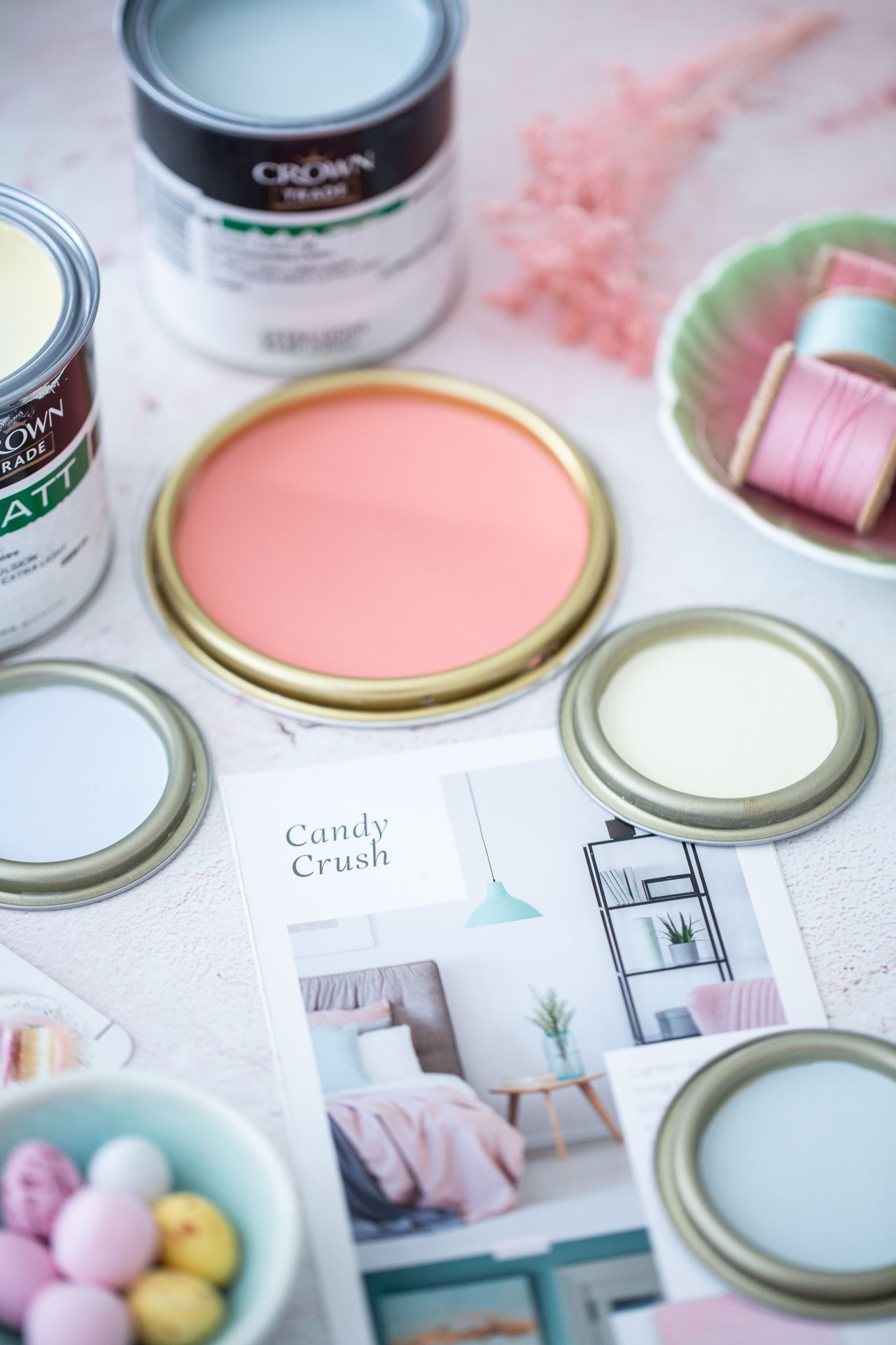
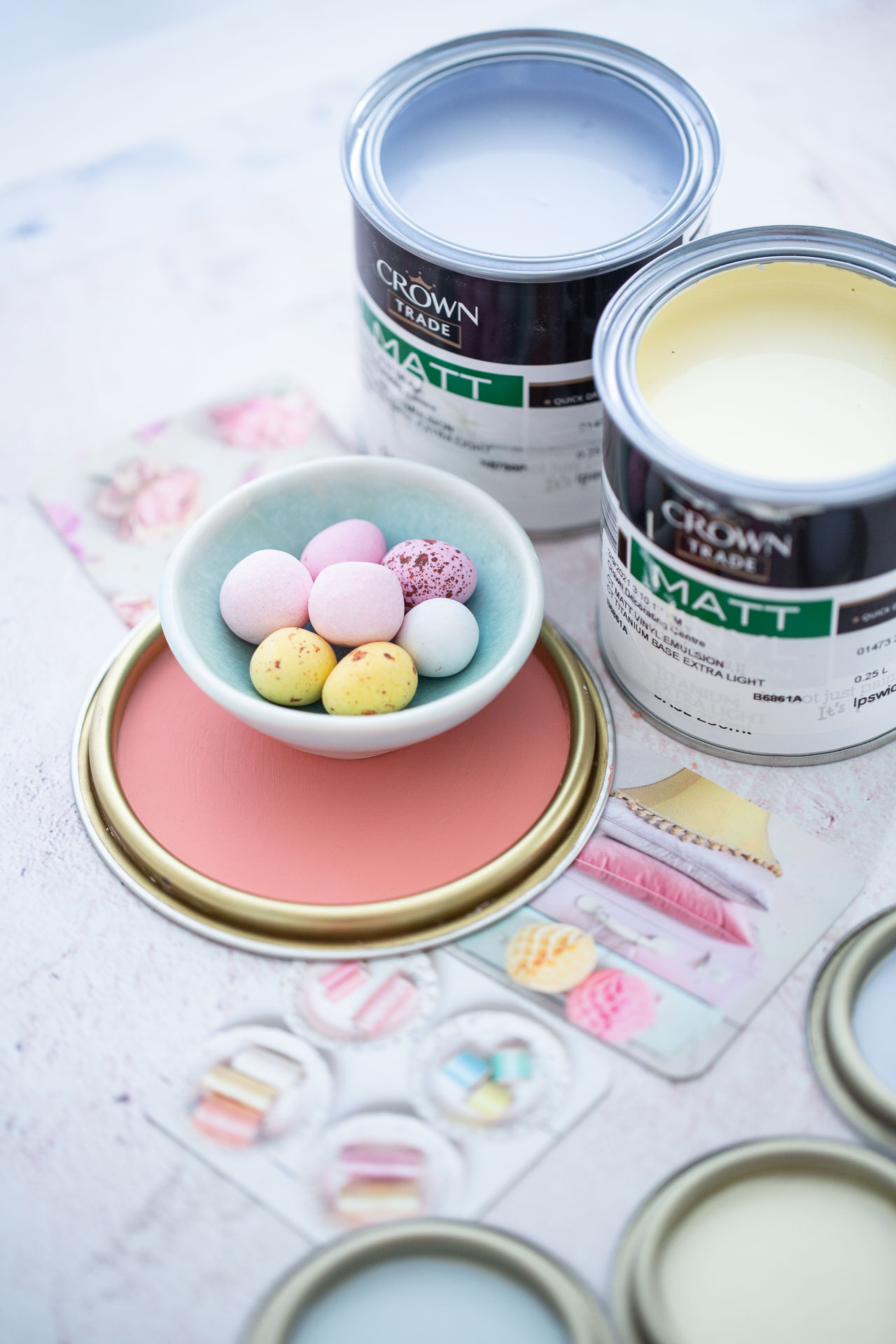
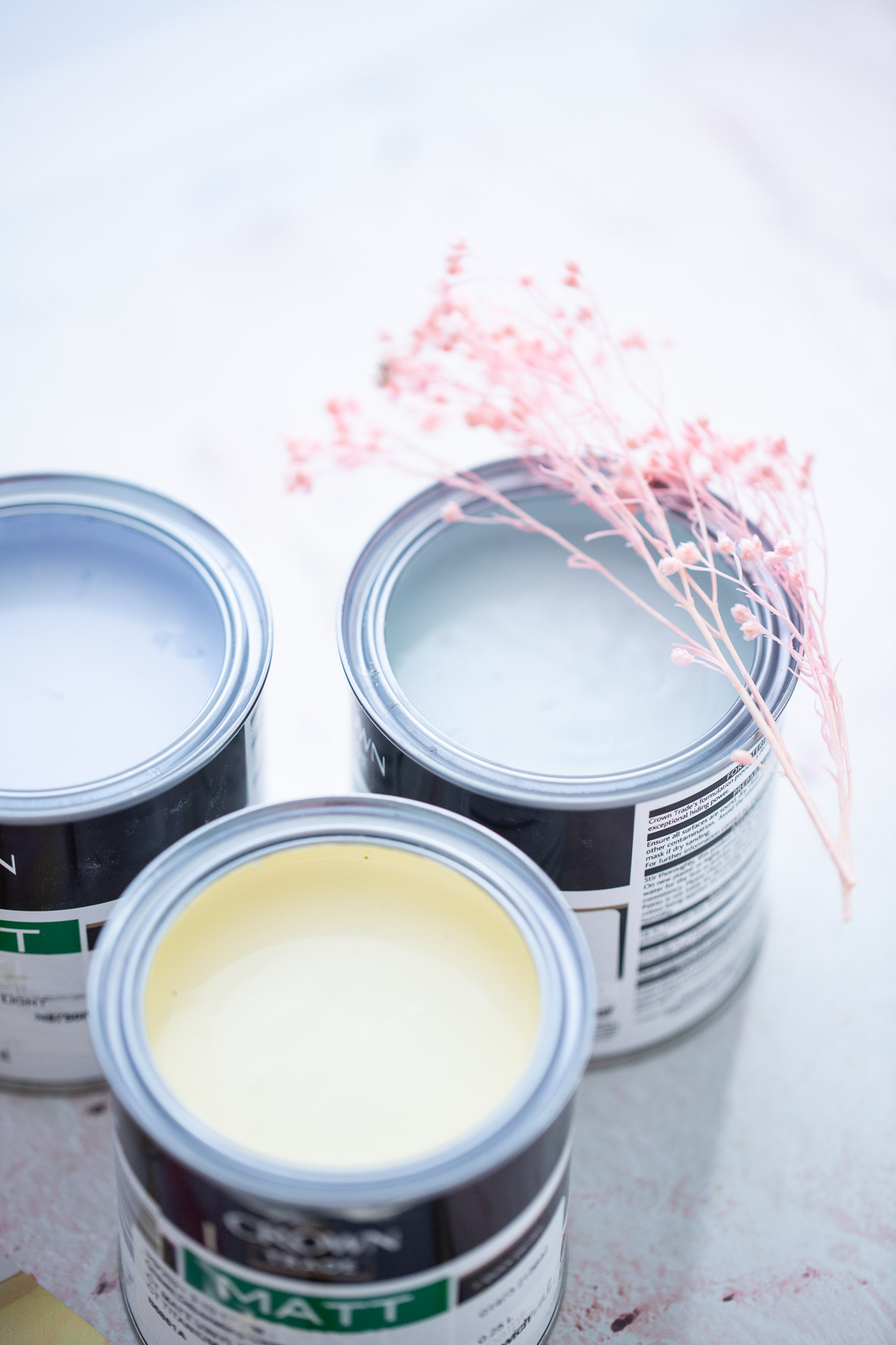
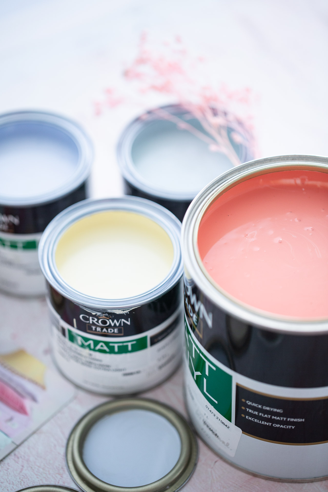
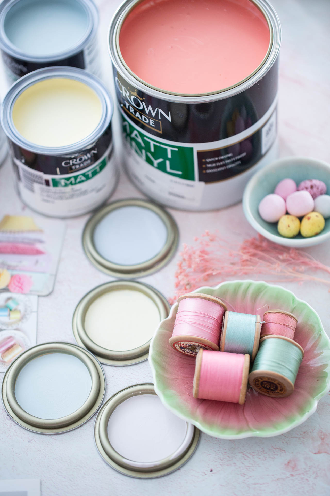
The palette is called Candy Crush, and as the name suggests, these colours are sweet and refreshing. And that feels like exactly what's needed right now; as we reset, refresh and re-enter the world. And try to have a bit of fun while we're at it.
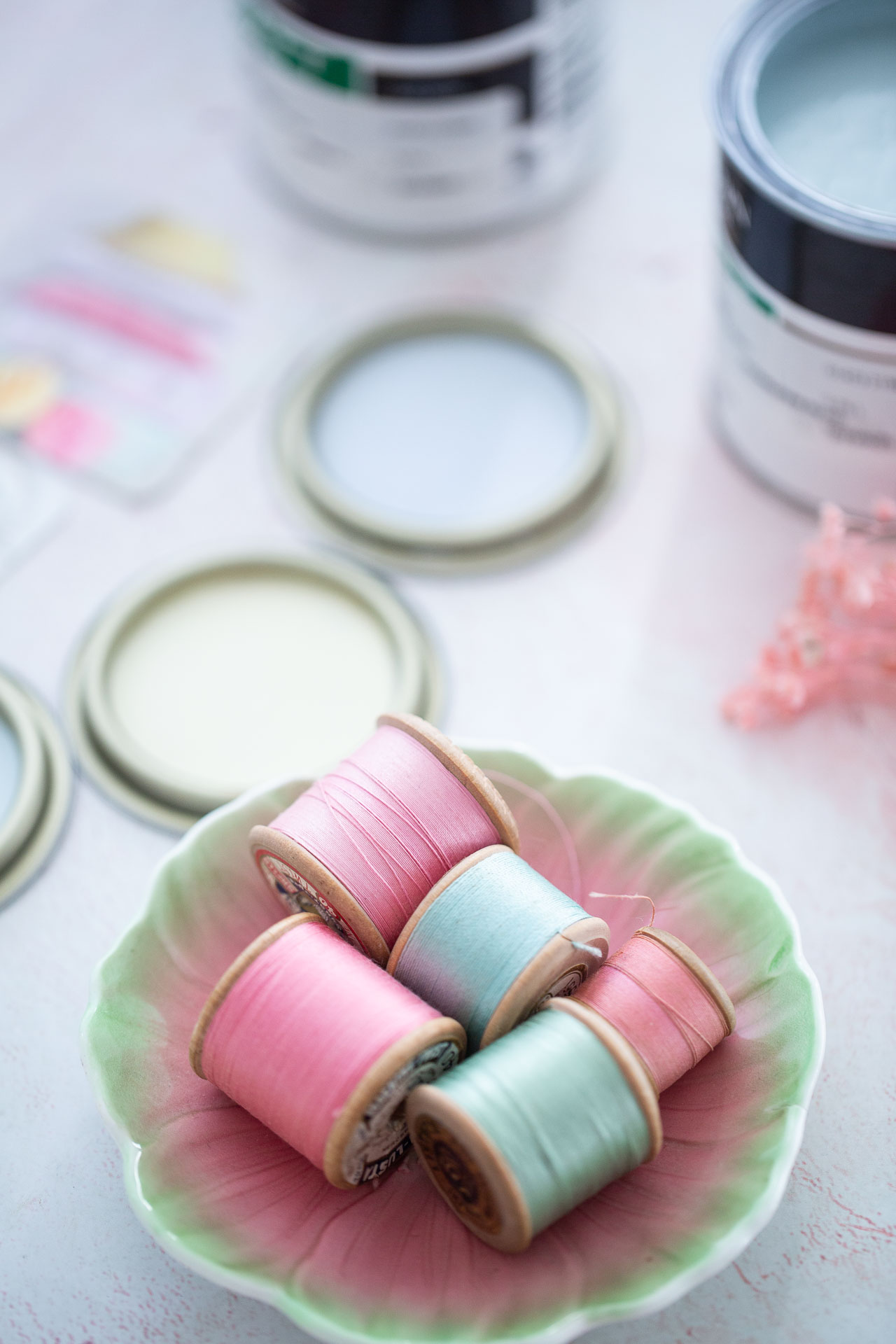
This palette is offering something light and uplifting in 'feel good' powdery hues. There is an element of nostalgia here, and these colours have been inspired by ice-cream, old-fashioned beach holidays. So while we might not be whirling away to a dreamy postcard-worthy seaside, we can at least bring it all to us.
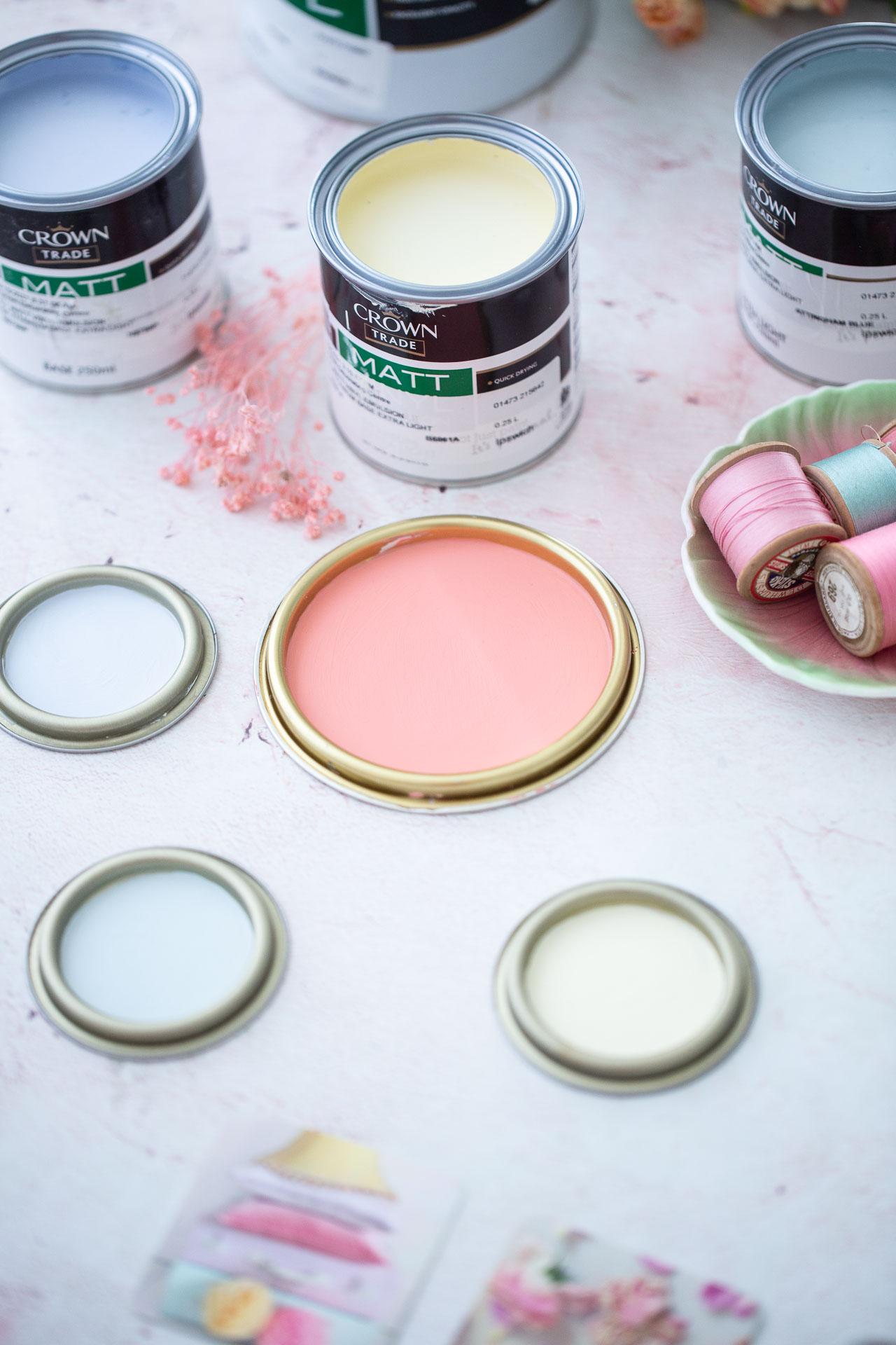
Powdery hues and ice-cream shades are not only cheerful, they're stylish. With Neo Mint hailed as the new shade of the decade, pastels are are no doubt having their moment.
"Pastels have been gracing our commercial spaces for the past year. These have started to creep into our homes and will continue to. There is a certain playfulness in pastel hues, like candyfloss pink and mint green. Certainly, for children’s spaces, these are light-hearted and sweet colours. They can work beautifully in bathrooms too incorporating tiles and paint in different pastel tones", explains Roisin Lafferty, Founder and Creative Director at Kingston Lafferty Design.
Though pastel colours are often used for children's spaces, consider adding them to different areas of your home. How cool would a retro-style kitchen be using a sunny yellow or cool mint?
In terms of styling, we'd recommend leaning into the playfulness of the palette. Think deck chair stripes, ditsy florals, retro appliances, enamel and kitch décor.
There's something comforting about these sweet, nostalgic shades. And that's why we wanted to share them with you. "I think we have definitely seen a shift towards colours that make us feel safe and calm within the confines of our four walls- and I mean that in the literal sense, which is something I never anticipated happening in our lifetime", claims blogger Reena Simon from Hygge for Home.
To learn more about our collaboration with Crown, and to see the Warm Blues palette, pop on over to out first instalment of this colour story series here. And check out the gorgeous green Pine Forest palette here.
If you use any of our Moodboards collection, please tag both @houseandhomemagazine and @crownpaintsireland on Instagram and use hashtags #moodboardsIRL and #togetherwearebrilliant. We love seeing how you make these colours your own. 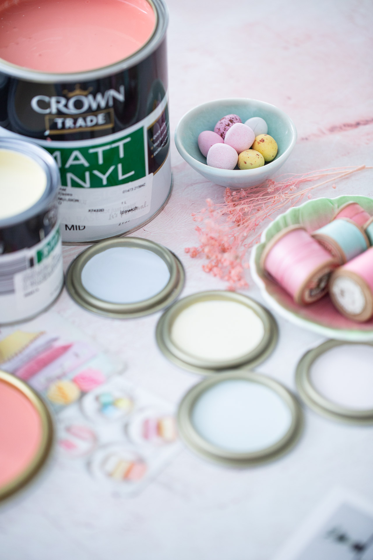
Crown Moodboards collection is available nationwide.
Styling by Ciara Elliott
Photography by Tamsyn Morgans
Videography by Poppy Bertram


